Sunday, July 22, 2012

JetPens.com Review - Iwako Giraffe Eraser

A few weeks ago, JetPens.com (whom I adore, as a complete pen junkie), put out a call for reviewers of their products.  No one had to ask me twice, I signed up right away.  About two weeks ago, I received this:

Isn't he cute??  It's the Iwako Giraffe Eraser, part of the Iwako Zoo collection of animal erasers.  His head even turns.  I was skeptical that it would erase, but it did, while not even making a dent in his wee nose.

Iwako makes all kinds of novelty erasers - from an American Fast Food lunch collection (including the little tray to put them on), to a Sushi Bento Box!  They're very affordable (the Sushi Bento Box, which includes a little yellow box for the erasers, is $5.50 USD), and very well made.  These are not going to fall apart the minute the eraser touches a pencil mark.

I ran this Giraffe Eraser by my two nieces and nephew, because really, that seems the target audience for this kind of product.  Here were my responses:

Me:  "What do you think of this Giraffe Eraser?"

James (age 6):  "Cool, can I have it?"

Elizabeth (age 7):  "Ooooo, can I have it?"

Hellen (age 2):  "Me want."

There you have it folks - perfect for kids and for adults who like Kawaii stuff.  

I honestly can't recommend JetPens.com enough.  I ordered a set of Gelly Roll Stardust pens from them, as well as a bunch of Pentel Metallic Sunburst pens, and not only was it affordable, but they shipped right away, and the pens are a dream to use on my art journal pages (they write well on acrylic paint!).  They stock pens that are hard to get and fun to use (like the infamous Uniball Signo White Gel pen - the one made in Japan, not the one made in the US, that seems to work better and last longer).  Plus, it's just fun to go shopping on their site - pages and pages of pens to consider and ponder and lust after.  

If you're interested in learning more about specific pens for art journaling (most sold at JetPens.com), then I recommend Kelly Kilmer's post, here:  http://kellykilmer.blogspot.com/2010/01/my-pen-list.html.  She's been art journaling for many years, and has done the testing for you when it comes to pens that work.

Tuesday, July 10, 2012

Online Classes for Art Journaling - Just Be Careful

I've noticed lately a rise in the number of people teaching self-exploration art journaling, and it's got me a bit worried.  Let me explain why.

It's one thing for you to use your art journal for self-exploration.  You can explore into the depths you want, pull back when it's too much - really take your time on your journey.  Art journaling really is a perfect vehicle for self-exploration and process work.

Here's the problem, though, with someone teaching you to use art journaling for self-exploration - you are paying them to take you on a journey, and therefore, you are entering into a form of therapy.  And from what I've seen, it's all artists teaching these classes, not therapists, counselors or social workers.  In other words, they have ZERO qualifications to walk you through what is essentially a therapeutic process.

I took an on-line class a couple of years ago that was purported to take you into the depths of yourself, using art journaling.  This teacher advertised that she would be there every step of the way, and would work her magic on the spreads you produced.  I trusted that.  Well, on the third lesson, we were diving into our origins, family stuff, heavy stuff, and I was feeling pretty vulnerable and raw.  I posted my spread, and waited for her to comment.  And then I waited some more.  And the other women waited.  It took a week for her to get back to any of our pages.  That in itself was painful.  But then, she did something completely unexpected - she totally invalidated my experience.  She told me it was an "old story", and that I needed to move on.

I was deeply hurt and confused.  When she told me it was an old story, I felt slapped in the face.  We were asked to talk about our origins, I did, and I felt like the teacher stuck her fingers in her ears and said "Lalalala, I don't want to hear this."  I feel I need to add that I wasn’t whining, I wasn’t asking for sympathy – I was just as honest as I could be about where I came from.  That was what was asked of us for the lesson, that's what I did.  But this teacher did NOT know how to handle traumatic experiences, at all.  Not only were we all left hanging, me with my soul raw and exposed to a stranger (and on the third lesson - there was no time to ease into it), but then I was completely invalidated.  Validation is one of the most important therapeutic tools there is.  It's a necessary process in a therapeutic relationship - it builds trust and helps a person move on from the experience. I had shared something very deep and painful, in a group setting, and the teacher trampled on my experience.

However, I was also lucky.  I happened to be in real therapy at the time, and was able to be validated there - not only about my experience with my origins, but that an artist with no training in therapy had no business to be practicing it.  My therapist was pissed, actually, because it's just so dangerous.

See, what happens to the women in these classes, who aren't in therapy, that trust like I did, and then aren't helped?  What happens when a meltdown occurs, and the teacher has no idea how to handle it?  What happens when several women meltdown?  What happens when someone sends out a cry for help, on-line, because they’ve just been completely triggered?  It’s dangerous, to try to lead people on the path of self-exploration, without any training.  That's what therapy is for.

And please, don't get me wrong - like I said above, art journaling is a perfect vehicle for probing the depths of yourself and your soul.  But you can do that, without paying someone else to teach you how.  Only you know what's safe and what isn't.  Only you know your triggers and outcomes.  You don't have to follow someone's outline to do soul-work in your art journal.  In fact, you probably shouldn't - they may ask you to go somewhere you're not ready to go.  No one can cookie-cutter, one-size-fits-all when it comes to self-exploration.

I learned a powerful lesson, by taking one of these classes, and that was if I want therapy, I'll pay a therapist.  If I want to explore myself, there are a million-and-one prompts out there, in Google-land, that are free for the asking.  But I will never put my trust into an artist trying to pretend to be a therapist again.  

So, please, just be careful out there. 

Saturday, June 30, 2012

I didn't lose anything...

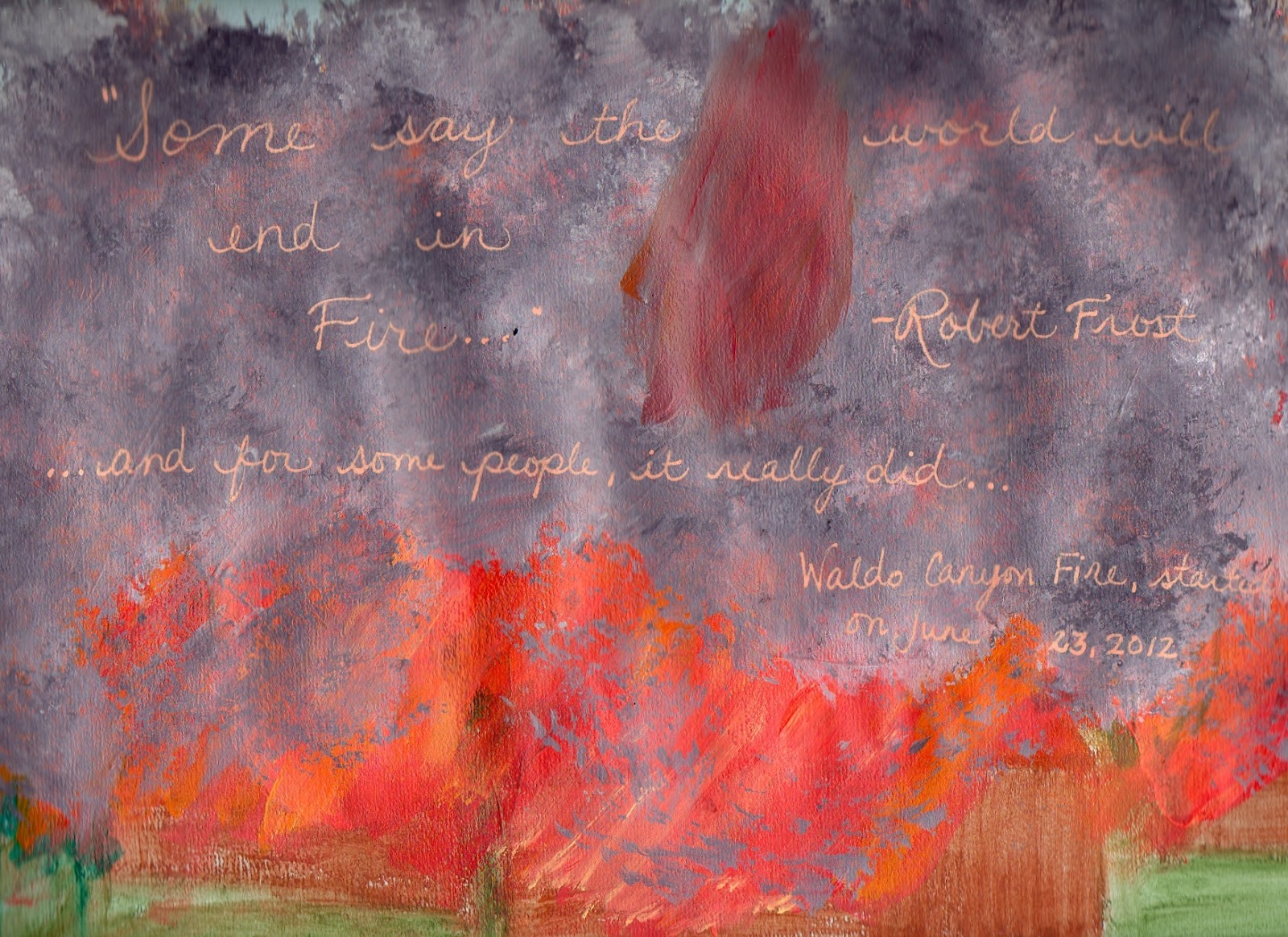
...to the Waldo Canyon Fire.  I am safe, my family is safe, no material possessions or homes have been lost, for me and mine.  We are so, so blessed.

You may have heard about it on the news.  Last Tuesday, June 26, 2012, the wildfire that had been burning outside of Colorado Springs decided to jump right outta Queen's Canyon, and into a neighborhood called Mountain Shadows.

I remember sometime in the middle '80's, when Mountain Shadows was the location of the annual Parade of Homes.  We went, my family and I, and ooo-ed and ahh-ed at the posh living quarters that were being shown off.  It was considered a far outskirt of Colorado Springs, unincorporated at that point, I imagine.  I remember begging my mom, please, puh-leeeeze, let us live here, in one of these beautiful, perfect homes.  I didn't understand then that we couldn't afford it - all I knew is that I had walked into a real-life Barbie dream home (well, mountain chalet, at least).  My, how I and my little town have grown.

But that subdivision has been decimated.  Destroyed.  Devastated.  There aren't enough of, or the right kind of, words, to describe the level of destruction there.  354 homes, gone.  Burned down to the ground.  It's just, well, honestly, when I see the pictures of it and the flyovers, I'm speechless.  I know it's cliche, but it's true - it's like a horrific war movie, only no, this is real, this really happened.  It's overwhelming.

And 2 people are gone.  No one knows right now why, why they were in their home when the evacuations went out, why they didn't leave, why they didn't or couldn't get out.  I don't know who they are - I'm sure that information won't be released for weeks - but the family knows.  And my heart is floating somewhere out there, seeking them out, wishing I could say or do anything that would lighten the burden for them, the pain they feel.

It's seeking out the policeman or policewoman that had to track that family down, in all the chaos of the evacuations, to tell them the news.  It's seeking out the firefighters, who faced an unconquerable monster, who stood as David against 1000 Goliaths, hoping that everyone had gotten out alright, only to find out that no, for 2 people, they didn't.  It continues to seek out those same firefighters, and Army men, and Guardsmen, and Air Force personnel, and everyone who has come to help, who refuse to succumb to grief, for now, just for now, so that they can continue to protect us.

And it's seeking out the people that are still under mandatory evacuation, who are tired, frustrated, and lost right now, because the future of their home, their rock, is still uncertain.  They are drifters at the moment, and completely at the mercy of the fire.  That's a horrible place to be.

My heart is flying all over this city of mine, with love, with grief, with tears, with complete and utter gratitude.

I did an art journal page about this.  It's not good art, but somehow, painting homes, painting trees, painting fire, painting smoke, it helped a little.  Next, I will paint rain, and pray that it will wash over us all.


Wednesday, June 20, 2012

I'm back again - Oil Pastel Review

So, as I said in my last post (over a year ago - whoa!), I've been working more on art, and less on product comparisons.  I've finally gotten brave with sharing my art, over on Flickr, and with various mixed-media art groups I'm a part of - like The Sisterhood of the Book (Effy Wild's Book of Days program).  I've even expanded out of my art journal, and onto canvas.  

I was chatting with a friend of mine the other day, and she suggested that if folks are wanting to share their stuff, they might as well get a blog.  And I realized "Hey!  I already have a blog!  That's what I should be doing!".  So, here I am, ready, finally, to share my art and process and the whole she-bang, with all of you.

But first, I've got to do a product review.  I mean, I have to - it's been waiting to spill out of me for days.  I want to talk about oil pastels.

Now, as a disclaimer, I am not an artist who knows the ins and outs of oil pastels.  In fact, I had some for a long time, and had no idea what to do with them.  Yes, they're pretty and smooshy, but in art journals, you can't write over them (unless you use a Sharpie Poster Paint pen - Oil-Based - but that's another post).  

Oh ho, but then along came Rhomany, and her live UStream class, about using oil pastels as a final layer of color in portraits.  And all I can say is "LOVE!!".  I am smitten with them, and how blendy and smooth the finished product turns out.  I mean, just look at how smooth my blue woman came out:


So, I wanted to share with you all a little test I did of the different oil pastel brands I have, and give you a rundown of what I think.  In case you want to try Rhomany's method.  And I think you do - yes, yes, you do.

Here's the image of each of the oil pastels I ran a test on.  I scribbled over the swatch area, and then on the right side, blended it out with my finger, to show you the smushability (is that even a word?)  I did them all in peach flesh tones, because I only have one Sennelier oil pastel, and it's a peachy flesh tone.  Trust me, if you've seen how much Sennelier's are, you'd only buy one at a time, too (mine was $3.50 for 2 inches of oil pastel).


1.  Sennelier - These are the creme de la creme of oil pastels.  Creamy, ultra-blendable, rich pigment.  Luscious to work with.  However, super expensive.

2.  Crayola's Portfolio Water-Soluable Oil Pastels - Very creamy - about as creamy as the Sennelier.  As you can see, not as pigmented as the Sennelier, but definitely not as expensive.  I got my set at Staples for about $10. They have the added bonus of being water-soluable, so you can go over them with a waterbrush and make a watercolor effect.  However, they only come in 24 colors.

3.  Crayola Oil Pastels - Yup, Crayola.  I am falling in love with Crayola products.  These aren't half-bad, for the set of 28 I got.  I used both the Crayola and the Portfolio oil pastels on my blue girl above, and really like the blendability and color I got from them.  And, they were only $5.50 at my local Michael's.  

4.  Loew-Cornell Oil Pastels - I bought a set of these at Michael's over 10 years ago.  They're still laying down a rich layer of color.  And before you think I'm a total art supply junkie, I bought the Crayola Oil Pastels to replace these.  After 10+ years, they're a bit dry and I have to really smash them down to lay down color.  Makes it hard to work with them.  But, if you can find them, they're inexpensive (I think I paid $10 for the set of 36) and obviously last quite awhile.  If I'd found these, I would have bought them again, instead of the Crayola.

5.  Cray-Pas Junior Artist - Ok, seriously, don't even bother with these.  I bought this set to replace the Loew-Cornell's, too, last year, when I took Pam Carriker's free online mixed-media class for Strathmore (it was a great class, by the way, and she's uploaded all 4 lessons to her YouTube channel - here's lesson 1: http://www.youtube.com/watch?v=s3eio-z-OQI&feature=plcp).  When I went to do her technique of blending the oil pastels, I rubbed these oil pastels right off of the page.  I've tried them on all kinds of paper, with gesso and without, and nope - if you want to blend them, you will rub them off.  About $7 for the set of 50, looks really yummy in the packaging, but they're just horrible.

I know that Cray-Pas makes a set of oil pastels called "Expressionist", that are supposed to be much better.  I just didn't want to invest the $20 in the set of 48 at my local art supply store.

So, my recommendation is, if you want to just try oil pastels, to see if you'll like them, then get a set of the Crayola Portfolio Water-Soluable Oil Pastels.  Personally, I'm using those, in combination with the Crayola regular set, on my portraits.  If you get serious about it, then yes, Sennelier is worth the investment.  I've also heard good things about Pentel oil pastels - that they're about in the same league as the Crayola and Loew-Cornell ones.  There's a wider range of colors with the Pentel ones, too (sold at Hobby Lobby).

So, thanks for stopping by, and I'll be seeing much, much more of you in the future!

Thursday, February 17, 2011

A Little Art Journal LOVE

ATTENTION: If you subscribed to this blog because of the experiments I was doing, I just want to warn you, this isn't an experiment post (well, unless you consider art journal pages to be experiments, which, I do). It's an art journal page post. Just didn't want you to get to the end of this post and go "Hey, where's the experiment?". :D

Connie over at Dirty Footprints Studio is hosting an art journal LOVE party this week, not only in honor of Valentine's Day, but as a celebration of when she kicked off Art Journal LOVE Letters (her art journaling online workshop), this time last year. To participate in the party, head on over to her blog by clicking on the pic below:


I realize this blog post has nothing to do with experiments - at all. I haven't done a proper experiment in almost a year, and the last post I did was after another year hiatus. I'm thinking I'm done with the experiments phase of my creative development - at least, on a grand scale.

Know what happened? I actually started DOING art, instead of just experimenting with art supplies. And I gotta tell you, I'm so grateful for all those experiments, because those were my baby steps, my way of getting over the paralyzing FEAR over doing something creative. I have a ridiculous streak of perfectionism, and while I mooned and pined and wished I could make beautiful art journal pages, every time I'd pick up a brush, I'd just about hyperventilate from fear. Fear that it wouldn't look good, fear because I don't know what I'm doing, fear of people pointing and laughing (even if I never showed another soul on this planet - no, fear is not rational), fear of the word "art". My fear/perfectionism usually manifests in a "Why bother?" attitude, as in "It won't be good/better/the best art journal page to ever exist, so why bother? You will FAIL!!"

Nice voice, eh? Do you have one, too? If not in art, in other areas?

So, what's a left-brained girl to do? Fall back on her scientific roots and experiment, that's what. Taking online classes definitely helped, too. Uploading my work into those online classes - yup, that started taking the fear down a peg or too. And having the loving support of an artist friend, who frequently reminds me that this is about the FUN of it all, not the outcome, well, that's been absolutely vital and precious to me.

And somehow, in getting to know all of these wonderful materials, in learning and experimenting, the courage to just begin came through.

I realized as I was typing this out, that what it all took was ACTION. I had to actually DO things to chip away at that snotty little "Why bother?" voice. There was no THINKING my way out of this - it took experiments, learning, talking, and sharing, to get me creating art journal pages now.

Methinks that's a life lesson right there. :D

Anyways, I'm sharing a Valentine-y page I'm working on - all pinks and reds and Love - as part of Connie's Art Journal Blog Party. It's not finished - it's at a place where I'm not sure where to go next. But it's also at a stage that I feel comfortable sharing with all of you. Pretty cool, for someone who couldn't even paint a solid-colored background 3 years ago without freaking out. :D

Pink Love Page


Thank you so much, to those that read and subscribed to this blog. Because I'm changing, the format of this blog will be changing as well. Honestly, I can't see me doing experiments, on the scale I was before. Maybe little ones, like the PanPastel experiment, but no more grand-scale ones. I just want to give anyone that subscribed a heads up about this, in case you start seeing more posts from me, but not the experiments posts you originally signed up for.

Wednesday, April 28, 2010

A wee experiment with PanPastels

Well hello all! It's nice to see you, and nice to be blogging again. :D Nothing really happened in the last, oh, year or so that I stopped blogging here, lol - no family emergencies, no mid-life crisis', no life-changing events. I just wasn't doing any experiments. It happens - my need to be an art scientist waxes and wanes. However, with Spring springing, and me learning new art techniques, there are a few things I'm wanting to try out. And of course, when I try something out, I want to share it, in case it will benefit anyone else.

Today, I did just an easy experiment with PanPastels. I've been hearing about these little stacks of wonder from so many places, and they've inspired some serious art supply lust in me. From what I understand, people are enthralled with PanPastels because of the lack of dust and their blendability. I love how Teesha Moore uses them to shade her journal pages. I limited myself to one, and only one, as a tester - at $5 per pastel (and that's at Dick Blick - it was a little over $6 at my local art supply store), this is not an art supply I can just run out and invest in a whole set.

Let me add a couple of caveats before I get started. First, I am not a pastel artist. I cannot even begin to comment on whether this is the right product for the real pastel artists out there. I'm just a beginning crafter/artist, who likes to dabble with lots of art supplies, and so this experiment is geared for folks like me - the dabblers. :D The second caveat is that this experiment was quick and dirty (literally, lol - my hands are a nice shade of grey at the moment), so I've foregone a lot of my usual structure when it comes to this experiment.

Ok, on with the experiment!

I wanted to test a couple of things with this experiment:

1. Are PanPastels really less dusty?
2. Is there any difference in the color intensity, between the PanPastel and the Sennelier soft pastels that I have? Meaning, can I swipe a sponge over a Sennelier soft pastel, and get them to blend like the PanPastel, without losing color intensity along the way?
3. Can I use cheap cosmetic sponges to apply the PanPastels, or is it really better to use the Sofft tools that PanPastel makes for these?

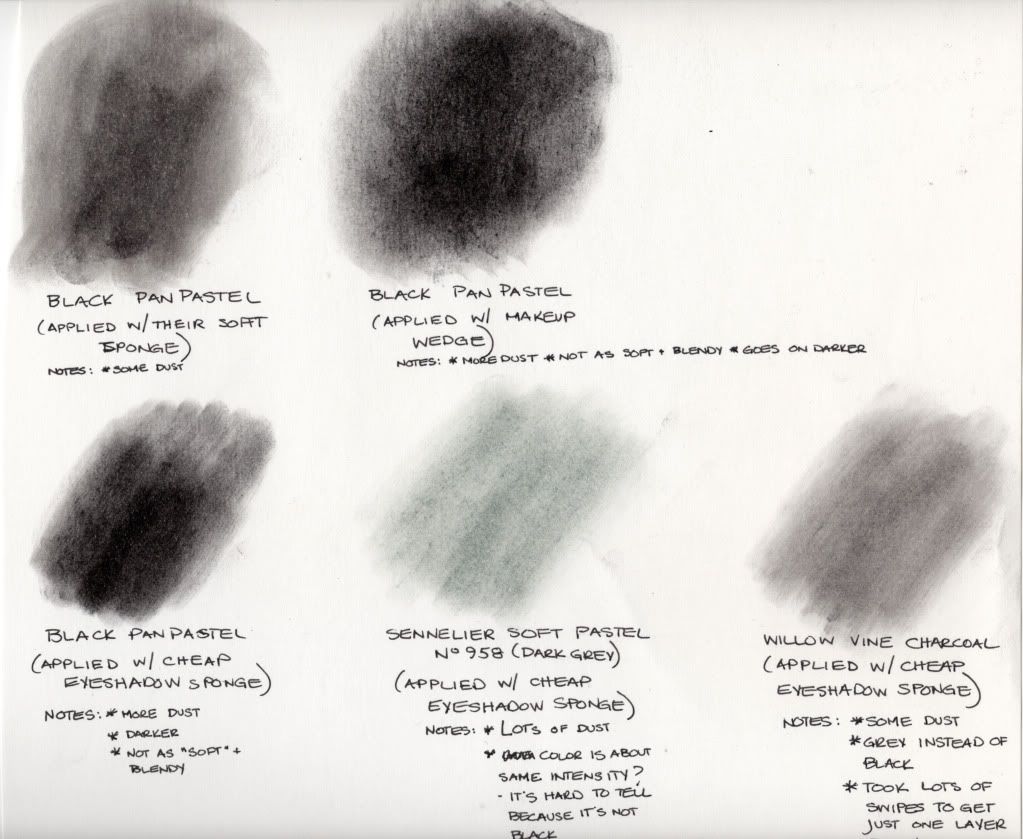
Here's the picture that reveals all:

(click to enlarge)


The Results:

1. Are PanPastels really less dusty?

YES, by far. While I did get some dust using their Sofft tool, and more dust using cheap cosmetic wedges and eyeshadow applicators, it was nothing compared to the Sennelier soft pastel.

2. Is there any difference in color intensity between a PanPastel and a Sennelier soft pastel?

Yes, it seems PanPastels do have more intensity, using the sponge method. But, it's also hard to tell from my experiment, because I don't have a black Sennelier soft pastel, so I'm not comparing black to black. Also, I didn't use the No. 958 Cinereous Grey Sennelier (my darkest Sennelier pastel) as it was made to be used - by drawing with it. So no, it didn't come out as dark, by just swiping the sponge over it, and applying the sponge to the page. However, it may darken up significantly with more layers.

I wanted to see if I could blend a Sennelier pastel like it was a PanPastel (because I already have a set of Sennelier's, and Sennelier also makes glittery, shimmery pastels that are just so beautiful), and it looks like I can - I'm just going to need more layers. Or maybe I should just draw with it and use an eyeshadow sponge to blend it out. See, I told you I wasn't a pastel artist - they'd know how to achieve that soft, blendy look with a Sennelier. :D

3. Can I use cheap cosmetic sponges, or do I really need to use the Sofft tools that PanPastel makes for these?

Well, that's a matter of personal preference. There is a difference between using the Sofft sponge, and using a drug-store cosmetic sponge. With the Sofft tool, there was less dust, and the pastel seemed to blend more, and come out softer. However, with the cosmetic sponge (and subsequently, the eyeshadow sponges), the color is closer to a true black, with harder "lines". It's not quite as "blendy". So, if you want your PanPastel to show up darker, and not be as soft, then use cosmetic sponges. It will certainly save you money!

As a bonus, I also tried to swipe an eyeshadow sponge over some willow vine charcoal, and apply it like I had the Sennelier soft pastel, just to see how the Black PanPastel would compare with the charcoal. Wow, is all I can say - PanPastel has got charcoal beat as far as a true black goes - at least, the way I applied it. If I'd drawn with the charcoal, it might have come out much darker.

So that's it, a quick and dirty experiment with a PanPastel. I'm not sure I'm sold. I love how soft and blendy it looks, but I also wonder if I can achieve that look with my Sennelier's, that I've already invested money in. So for me, the jury is still out.

Monday, July 27, 2009

The Great Pearl-Ex + Mediums Experiment of Ought-Nine - Part Two

So, here we go, for Round Two of the Great Pearl-Ex + Mediums Experiment of '09. This time, I'm trying out my more unusual acrylic mediums, of the gel and paste variety. For Part One, please see this post. If you'd like to know more about Pearl-Ex, please visit Jacquard's website.

The Products:

For my Pearl-Ex mica powder, I again chose Aztec Gold (Product # 658), to use throughout these experiments. It's a rich, warm yellow gold that reminds me of gold leaf.

Here are the mediums that I mixed with the Aztec Gold for this round of experiments:
  • Golden's Clear Tar Gel
  • Liquitex Glass Bead Gel
  • Golden's Garnet Gel
  • Golden's Acrylic Ground for Pastels
  • Liquitex Blended Fibers Gel
  • Golden Light Molding Paste
  • Golden Crackle Paste
The Process:

Here, because of the nature of the mediums I was using, I chose a slightly different process than the first experiment. I took the same mini-scooper of Pearl-Ex powder, but used a full scoop of the powder (instead of only the 1/2 scoop in the 1st experiment), and added it to a little Dixie cup. Then, I added about a tablespoon of each medium, one per Dixie cup. It's too hard to pull out these mediums in 1/2 teaspoon quantities, so I opted to increase the amounts, while keeping the ratio of medium/Pearl-Ex about the same.

I then mixed each medium with its Pearl-Ex with a popsicle stick. Then, I painted all of the Pearl-Ex mixtures onto pre-labeled 3 inch x 4 inch black cardstock, so we could see how vibrant the Pearl-Ex would turn out. Each piece of cardstock only got one layer, although some of the layers are thicker than others, due to the nature of the medium (Light Molding Paste, Blended Fibers and the Crackle Paste). The only medium I didn't paint right away was the Clear Tar Gel - I waited about a half an hour before painting with it. Clear Tar Gel gets air bubbles in it very easily when it's stirred up, so I had to wait for some of the air bubbles to come to the surface.

After all of the mediums had dried, I taped them all together onto a larger piece of black cardstock, and photographed the results. I took two sets of pictures - one with flash, and one without. Because of the metallic nature of Pearl-Ex powders, it's easier to see their properties when you can view them in two different sets of lighting. It's kind of a virtual way of being able to "tilt the card", like you would in real life.

The Results:
Here are the mediums I used, labeled 1-7, as they correspond to the pictures:
  1. Golden's Clear Tar Gel
  2. Liquitex Glass Bead Gel
  3. Golden's Garnet Gel
  4. Golden's Acrylic Ground for Pastels
  5. Liquitex Blended Fibers Gel
  6. Golden Light Molding Paste
  7. Golden Crackle Paste
Here are the results, from a picture taken with my Sony DSC-F828, without flash:
(click to enlarge)

Here are the results, from a picture taken with my Sony DSC-F828, with a low flash (higher levels of flash, on my camera, tend to wash everything out):
(click to enlarge)

Conclusions:

Again, the Pearl-Ex Aztec Gold mixes beautifully with every medium I've thrown at it (no clumping or non-mixing, which has happened with some Pearl-Ex powders on me - namely "Flamingo Pink", "Brilliant Yellow" and "Turquoise").

Now I have another keyword to add to my "These Don't Do Well with Pearl-Ex" list - Opaque. So, "Matte" and "Opaque" - got it. The Crackle Paste and the Light Molding Paste are both opaque (I assume they have some Titanium or Zinc White added to them), and the vibrant metallic color of the Aztec Gold Pearl-Ex just disappeared in them. The same thing happened with the Acrylic Ground for Pastels, although, I can see what looks like a glittery-shimmer mixed into the medium (not obvious in the photo, but I can see it in real life). I think a wash of Pearl-Ex over these mediums will show up beautifully, just not mixed in them.

It's hard to tell in these photos (and I'm not sure why), but the Clear Tar Gel and Glass Bead Gel are just as vibrant as the results I got with Liquitex's Gloss Medium and Varnish (now my favorite Pearl-Ex medium paint-maker, besides Gum Arabic). I'm not really sure what to do with the Glass Bead Gel, and haven't been since I first got it, but I love the effect of the Aztec Gold in it. The Garnet Gel showed a more muted effect, but there's just enough shimmer with the Pearl-Ex to make it interesting. I can see adding one of the darker, more bronze colors of Pearl-Ex, to make this look like authentic rust.

The Blended Fibers is interesting - it looks a bit like paper on the page, and with the Pearl-Ex, it looks old and slightly shiny at the same time. There is some opacity to the Blended Fibers, so I believe a wash of Pearl-Ex would do much better than it being mixed in. I'm glad I did this experiment, as prior to this, I had no idea what to do with Blended Fibers, but now, I think I can add it to molds, and it will look like a tissue paper cast.

Next up will be the last part of this experiment, where I show you how Pearl-Ex and things like Linseed Oil, Minwax's Polycrylic, Dorland's Wax Medium and Isopropyl Alcohol look.

Friday, July 3, 2009

The Great Pearl-Ex + Mediums Experiment of Ought-Nine - Part One

We're going to take a little break from image transfers, and focus on Pearl-Ex mica powders, made by Jacquard. Pearl-ex mica powders are finely-ground metallic powders that can be used on just about any surface, in just about any medium.

If you're anything like me, the first thing you think, when you see one of the sets of 12 small pots of these metallic powders, is "What do I do with them?" Well, Jacquard's website, and Google, can answer that question better than I can, but one of the properties that drew me to them is that you can make them into a paint, using just about any paint medium out there. Well, I wanted to put that theory to the test, and try out Pearl-Ex with every paint medium I have.

Yes, you read that right; EVERY paint medium I have. And I have a ton, because I'm an art supply junkie. 95% of the mediums are for acrylics, but I'll be throwing in a watercolor and oil based medium in there, too.

This experiment is being run in 3 parts. This first part focuses on one watercolor medium (Gum Arabic) and 8 liquid and gel acrylic mediums. Part two will focus on unusual gel mediums (like Garnet Gel by Golden, and Blended Fibers by Liquitex). Part three will focus on things like Linseed Oil and Isopropyl Alcohol (I just have to see if they will blend with alcohol...how cool if these could be added to alcohol inks!), and anything else I may have left out by then.

Just as an FYI, Ranger makes a product that is similar to Pearl-Ex called "Perfect Pearls". The difference is that Perfect Pearls are mica powders with a binder already in them. All you have to do is add water to make the Perfect Pearls into a paint. But, if you Google "Perfect Pearls Techniques", you'll find a whole slew of additional techniques that you can also try with Pearl-Ex powders. Just know that you may need to add some kind of painting medium for some of those techniques to work.

The Products:

For my Pearl-Ex mica powder, I chose Aztec Gold (Product # 658), to use throughout these experiments. It's a rich, warm yellow gold that reminds me of gold leaf.

Here are the mediums that I mixed with the Aztec Gold for this round of experiments:
  • Liquitex Matte Medium
  • Liquitex Gloss Medium & Varnish
  • Liquitex Glazing Medium (Gloss)
  • Golden GAC 100
  • Golden Soft Gel - Matte
  • Golden Regular Gel - Matte
  • Liquitex Gloss Gel
  • Liquitex Iridescent Medium
  • USArtQuest Gum Arabic (Powdered)
  • Winsor & Newton Gum Arabic (Liquid)
The Process:

I took out a 10-well plastic mixing palette, and labelled each well with a Sharpie, with what medium I'd be putting in it. I took a half-scoop of the Aztec Gold Pearl-Ex, using a tiny scooper I have (see middle of palette in picture below), and placed it in each well. I then filled the rest of the well with the chosen medium (1/2 teaspoon of medium per well). I wanted the concentration of Pearl-Ex to Medium to be the same throughout, so that I truly see what difference the medium itself made, in how the Pearl-Ex then looked.

For the USArtQuest Powdered Gum Arabic, I added 1/2 scoop of Gum Arabic to the 1/2 scoop of Pearl-Ex Aztec Gold, then filled the rest of the well with tap water. This is a higher concentration of Gum Arabic than the Jacquard website calls for - they call for a 4:1 Pearl-Ex: Gum Arabic mix. I wasn't about to try to measure out 1/16 of a scoop of Gum Arabic, and I've mixed higher concentrations of Gum Arabic to Pearl-Ex before, with no ill results (in fact, it seems to bind better to the paper).


I then cut out 10 - 3" x 4" squares of black cardstock, and labelled each piece of cardstock with the medium/Pearl-Ex mixture I'd be painting on it. Metallics such as Pearl-Ex are their most vibrant over dark colors. After I'd mixed up all of the mediums, I painted on one layer of Pearl-Ex "paint" per piece of cardstock, one for each medium.

Once dry, I scanned in each piece of cardstock, and then realized I had a problem: metallics don't scan well, at all. This is something I hadn't considered when I set out to blog this experiment: metallics are very hard to capture with digital technology. So, what I'm going to show you isn't quite as vibrant as they are in real life. Here, I can tilt the metallics into the light, to see all of their properties, and I can't quite show you that. So, after the scans turned out so poorly, I took pictures of the results, both with flash and without flash, to try to approximate, as close as I can, what they look like to me. They're pretty close, I think.

The Results:

Here are the mediums I used, labeled 1-10, as they correspond to the pictures:
  1. Liquitex Matte Medium
  2. Liquitex Gloss Medium & Varnish
  3. Liquitex Glazing Medium (Gloss)
  4. Golden GAC 100
  5. Golden Soft Gel - Matte
  6. Golden Regular Gel - Matte
  7. Liquitex Gloss Gel
  8. Liquitex Iridescent Medium
  9. USArtQuest Gum Arabic (Powdered)
  10. Winsor & Newton Gum Arabic (Liquid)
Here are the results, from a picture taken with my Sony DSC-F828, without flash:


(click to enlarge)

Here are the results, from a picture taken with my Sony DSC-F828, with a low flash (higher levels of flash, on my camera, tend to wash everything out):


(click to enlarge)

Conclusions:

All of these mediums blended well with the Pearl-Ex Aztec Gold. Just an FYI, I've found that some Pearl-Ex powders don't mix well with acrylic mediums, which is an experiment to show you, down the road. But this particular one, Aztec Gold, mixed in beautifully with all these mediums. Prior to painting, I just had to re-stir up the liquid mediums, to ensure the pigment was evenly distributed.

I learned that using anything with "Matte" in its name is just not going to work with Pearl-Ex. Manufacturers add mattifying agents to their products, which is basically particles of "white stuff", to help tone down gloss. That white stuff and Pearl-Ex apparently cancel each other out. You can see how the color of the Pearl-Ex is imparted, but the metallic sheen is almost gone.

It looks like if the medium is glossy, then it and Pearl-Ex are going to get along the best. I love how vibrant and shiny the Liquitex Gloss Medium & Varnish, and the Liquitex Gloss Gel, came out. Those two are truest to what this Aztec Gold looks like in its jar.

The Golden GAC 100 and the Liquitex Glazing Medium (Gloss) toned down the metallic sheen just slightly. They're not supposed to have any matting agents, but something in these mediums is "hiding" some of the metallic shimmer.

Liquitex Iridescent Medium is a pearl medium, meaning, it's a white pearl color. That white almost took away the metallic of the Pearl-Ex, but because the medium itself has a metallic sheen to it, what resulted was still shiny and metallic, only much lighter. I can see using this as a way to lighten any Pearl-Ex powder, without taking away the shimmer.

And I have to say, I'm in love with Gum Arabic and this Pearl-Ex Aztec Gold. Both the powdered and the liquid versions turned out so rich and deep. I'm not sure what chemical property Gum Arabic has, that it causes Pearl-Ex to show off its darker undertones (while still retaining the metallic shimmer), but I love the effect.

That's it for this round. Stay tuned for Part Two, where I try out all kinds of unusual gel and paste mediums, and Pearl-Ex Aztec Gold.

Sunday, June 28, 2009

Rub-on Transfers - Laser Printed Transparencies

Now it's time to see if these rub-ons I've been experimenting with work with laser prints.

The Products:
  • Apollo Color Laser Printer Transparency Film (CG7070)
  • Samsung ML2010 Black & White Laser Printer
The Process:

Again, pretty simple. I just printed off my images onto the Transparency Film, using my laser printer this time, cut out my image, and then rubbed it onto my surface. I tried this in my art journal, which had a coat of gesso on it. I just wanted to see if it would work, so I wasn't worried about following the procedure I used in the 1st experiment, where I transferred an inkjet print onto a piece of plain copy paper.

This time, I went ahead and tried my transfer right away. I do believe that the sooner you make the transfer, from the time of printing, the easier it is to rub-off. I forgot to mention that the transfer I made in the 1st experiment, with inkjet prints, was done within one hour of printing, while the transfers I did for the 2nd experiment were done over 2-3 days after I'd printed them. It seems I had to rub much harder on those 2nd experiment transfers. Just a word to the wise, if you're going to try this.

The Results:


(click image to enlarge)

It worked!

Conclusions:

I think it worked even better than the inkjet prints I tried, in that it's clearer and darker (i.e. more ink came off of the transparency). However, the image itself printed more clearly with the laser printer (which makes sense, as the transparencies are made for laser printers). I also did this transfer within 5 minutes of printing it, so it's hard to tell if it's the laser toner that's making the difference, if it's the time factor that's making the difference, or if it's both.

I will be re-running the same experiment that I did with acrylic mediums, using these laser prints, over this next week. I want to see, again, how well they stand up to abuse and wet mediums. Because the prints will be older by the time I transfer them (I printed off a bunch of the same image on the same transparency), maybe we'll be able to tell if time makes a difference in how much ink comes off the transparency and onto the surface.

ETA: From some of the comments and emails I've been getting, I realized I wasn't being clear about something on these rub-on transfer experiments. I've been printing on the "right" side of the transparency, the side that's a little bit rough to the touch. This is the side that has the coating, that allows the ink to stay put on the film, without it beading right off. This is also the side that's recommended when doing Leslie Riley's technique for inkjet transfers. That's why I was so surprised that it worked - I didn't need a wet medium for me to be able to rub the print right off the transparency.

I do know that there is a technique where you can print on the "wrong" side of the transparency, the smooth side with no coating, and then immediately do a transfer onto your substrate. I've had problems with this in the past, where the ink would just bead up way too much for me. I have yet to try that technique with these printers, but I've added it to the list. But, it's another reason why I was so excited that these worked - the need to transfer immediately seemed to be taken away. Of course, I've noticed that it's easier, when it comes to the rubbing, to do it sooner than later, but it's not necessary. I was able to print off a whole slew of images onto one transparency that I can save for later.

Just wanted to make sure I'm being clear. :D

Saturday, June 27, 2009

Rub-on Transfers - Results of some experimenting

In my last post, I was prompted by Zom (from Pinch Me to See if You're Dreaming...fabulous blog, go check her out) to ask the question "Ok, how well do these rub-on transfers hold up to abuse, or being painted over?" So here is the experiment to answer that question. Because I use mostly acrylic and craft paints, the experiment is focused on how well these transfers do with acrylic mediums.

The Products:

I transferred my rub-ons onto 4 different acrylic painted surfaces, and then one set of images I transferred onto uncoated paper. These were all done on the back of a piece of Canson Acrylic Paper (my pad of paper looks like what's in the link, but Canson has changed it to look like this now).

Here are the four acrylic mediums I used:

The Process:


(This is lengthy, so if you want to skip it, I recommend heading to the Results section, and looking at the pictures.)

I wanted to see if transferring these rub-ons to various acrylic mediums would alter how well they stood up to abuse. So, I tried a craft paint, a high-quality acrylic paint, gesso, and matte medium. I chose to try craft paint vs. a high-quality acrylic paint, because craft paints use fillers and non-pure pigments, and I wanted to see if that made any difference in how well the transfers held up. Again, like in my previous post, I also transferred the rub-ons onto plain paper, with no medium under-coating, to see if that made a difference as well.

First, I printed out the same, highly-detailed image onto one Apollo Color Laser Printer Transparency Film (Product Number CG7070), 20 times (so I would have extra), using my Epson Workforce 500 all-in-one printer. Then, I painted three swatches of each acrylic product onto the back of a piece of Canson Acrylic Paper. Canson Acrylic paper has a canvas-like texture embedded in the paper, and the front is coated with a gelatin-like substance. I used the back of this paper, so the gelatin coating wouldn't interfere with the results. I wanted a thick, canvas-like paper that would withstand the "wetness" of acrylic mediums, to prevent any wrinkling when I painted on the mediums. Plus, I wanted to see what these transfers would look like on a rougher surface, while I was at it. :D

I cut out each individual image, and rubbed one onto each of the three acrylic-coated surfaces, as well as rubbing three transfers onto the plain, uncoated paper. So, we have a total of 15 transfers to examine.

For each acrylic medium, and the ones on plain paper, I left one of the transfers alone, so we could see what it looks like if it's not touched. I smudged the 2nd transfer on each medium with my finger, to see how much ink would come off. You should know, I rubbed VERY hard with a clean finger, because I really wanted to put these transfers to the test. I painted the 3rd transfer with matte medium, to see how well these transfers behave with a very wet acrylic medium.

Ideally, it would have been better to use one transfer, and then smudged it (and then taken before and after pictures), and then used another transfer, and then painted it with the Matte Medium (and then taken before and after pictures), but I just didn't think of it at the time I did this experiment. Just wanted to mention that. :D

This is all easier to understand when you see the pictures, I promise.

The Results:

Here is the image that I used, as it looked printed out onto the transparency film:


And here is the first set of results, on the Delta Ceramcoat Fleshtone, the Golden Heavy Body Titan Buff, and the Plain, Uncoated Canson Acrylic Paper:

(click on image to enlarge, to really see how these turned out)

And here are the second set of results, on Golden White Gesso, and on Liquitex Matte Medium:

(click on image, please)

There are two transfer results for the "Plain paper, Matte Medium Undercoat, Matte Medium Overcoat", in the first results image, because my first transfer came out so light. I just wasn't rubbing hard enough to get it transferred. So, I did a second rub-on transfer, and did the experiment on both, just to see what would happen.

As far as rubbing on the transfers, it was easier to get the ink off the transparency on the Delta Ceramcoat paint, the Golden Heavy Body Titan Buff and the Golden Gesso, with the Gesso being the easiest. I had to rub hard on all of these transfers, but it seemed I didn't have to rub as hard, or for as long, to get the ink on to those three mediums.

Here are the results for which transfers looked the best when just left alone (not smudged and not painted over with Matte Medium), ranked from best to worst:

  1. Golden Gesso - White
  2. Delta Ceramcoat - Fleshtone
  3. Golden Heavy Body - Titan Buff
  4. Plain, uncoated side of Canson Acrylic Paper
  5. Liquitex Matte Medium

These results are a bit skewed, because what really mattered was how well I held the transfer still, and how hard I rubbed. Therefore, the Plain, uncoated paper looks all smudgy, but that's because the transfer moved while I was rubbing. So, take those results with a grain of salt. While I think the Golden Gesso really did outperform the rest, how hard you rub and how still you hold the image while you're rubbing, THOSE are the things that matter the most.


Here is how the transfers performed when I rubbed them with my finger, ranked from best (no smudging) to worst (look at all that smearing!):

  1. On plain, uncoated side of Canson Acrylic Paper (tiny smudges)
  2. On Golden Heavy Body - Titan Buff (tiny smudges)
  3. On Golden Gesso - White (obvious smudging)
  4. On Delta Ceramcoat - Fleshtone (total grey halo, lots of smudging)
  5. On Liquitex Matte Medium (total grey halo, lots of smudging)

And here is how they are ranked, from best to worst, when painted over with Liquitex Matte Medium:


  1. Golden Heavy Body - Titan Buff (no smudging -those greyish lines in the picture are a shadow, created by the brushstrokes, since the paint wasn't totally smooth)
  2. Delta Ceramcoat - Fleshtone (no smudging)
  3. Golden Gesso - White (no smudging)
  4. Liquitex Matte Medium (some streaking)
  5. Plain, uncoated side of Canson Acrylic Paper (wow, now there's some serious smudging)

Conclusions:

Personally, I was surprised with how well these transfers held up. Yes, painting matte medium over the plain transfer resulted in a smudgy, grey mess, but otherwise, overall, they did pretty good. Of my results, I was also surprised to see how poorly these transfers did over Matte Medium, in just a plain transfer, in being smudged and in being re-painted with more Matte Medium. I can't even begin to fathom why that would happen, but, ok, lesson learned. Don't do these transfers over Liquitex Matte Medium.

It looks like your/my best bet is to try these transfers over an acrylic paint or gesso, and then paint over them with matte medium (or perhaps another acrylic sealer, like gel medium or gloss medium), to ensure no smudging. I honestly don't know how well other sealers will work, but if I try a different medium, I'll let you know (I'm a Matte Medium kinda girl).

Ok, so will some of you go out, and try these rub-ons with the transparencies that you have, on your printers, to see if this works with other brands? I'm really curious if other combinations of inkjet transparency film and inkjet printers will let you do rub-ons. Heck, I'd love to see if this would work with laser transparencies and printers as well. Come Play with Me!

ETA: From some of the comments and emails I've been getting, I realized I wasn't being clear about something on these rub-on transfer experiments. I've been printing on the "right" side of the transparency, the side that's a little bit rough to the touch. This is the side that has the coating, that allows the ink to stay put on the film, without it beading right off. This is also the side that's recommended when doing Leslie Riley's technique for inkjet transfers. That's why I was so surprised that it worked - I didn't need a wet medium for me to be able to rub the print right off the transparency.

I do know that there is a technique where you can print on the "wrong" side of the transparency, the smooth side with no coating, and then immediately do a transfer onto your substrate. I've had problems with this in the past, where the ink would just bead up way too much for me. I have yet to try that technique with these printers, but I've added it to the list. But, it's another reason why I was so excited that these worked - the need to transfer immediately seemed to be taken away. Of course, I've noticed that it's easier, when it comes to the rubbing, to do it sooner than later, but it's not necessary. I was able to print off a whole slew of images onto one transparency that I can save for later.

Just wanted to make sure I'm being clear. :D