Sunday, April 6, 2014

Cheap Ways to Art Journal Part 3

Art Journal page from my Kid's Made Modern watercolor paper journal (see Part 1), craft paints, simple ephemera


And here we go, Part 3, where we're going to get into things like Gesso, Watercolors, and Water-Soluable products (like Portfolio's, Gelato's, etc).

  1. Gesso

    Gesso was one of those products that continually frustrated me, because it seemed no matter where I went, it was expensive.  I was even going to attempt to make my own with talc and white paint at one point (er, don't do this), because that's pretty much what it is - chalk, titanium white pigment (or black/gray/brown, depending on the brand and color) and acrylic binder.  I didn't use any for a few years, because I wasn't gonna pay $15 for 8 ounces of chalky paint.  But oy, I broke down, waited for a sale, and tried Golden's Gesso.  And it's lovely, and feels lovely to the touch, and only covers previous layers slightly, so there's this mystery peeking out from behind it.  But, alas, it's too much to keep up that habit.

    Then I found Martha Stewart's Gesso (sold at Michael's with her paint line, in the craft paint aisle), for $7 for 6 ounces.  So, with a 40% off coupon, that's about $4.  And it's wonderful stuff.  It's slightly thicker than Golden's gesso, so you can lay it on thick and then texturize it (write in it, stamp into it, create designs in it).  It comes in a pourable squeeze bottle, too, which I find a plus.  It's got this wonderful, fine tooth to it.  It's the closest I've come to Golden's Gesso, at a price that doesn't make me gulp.

    I will just say this about Liquitex BASICS Gesso - I love all of Liquitex's products I've tried, except this one.  This gesso is not just toothy - it's actually gritty, bumpy even.  So, if you try to glue down anything on top of it, the grit will prevent the piece from adhering completely.  It's the kind of gesso that needs to be sanded down between layers.  This goes for their Clear Gesso, too - same texture.  For some people, this isn't a deal-breaker, but for me, it is.  If I want a clear gesso, I'll just stick to Matte Medium - it's clear and has tooth to it - problem solved.  (Tip from the pro, Less Herger of Comfortable Shoes Studios - The professional gesso of the Liquitex line is smooth as silk.  What I'm talking about is their BASICS line).
  2. Watercolors

    Lots of people in the mixed-media world use watercolors, both tube and pan varieties, in their art journals.  I've seen people mix watercolors with acrylic/craft paints, with delightful results.  I've also seen art journals that are all pen-and-ink work, with watercolors for color.  I use watercolors on the faces of the girls I draw, because it lets the graphite shading I've worked on shine through.  But, for the most part, I consider watercolor paints to be an add-on with my pages, not the "main event" (like my craft paints), so my research on this is pretty slim.

    In this arena, I will just say this - buy what you can afford.  What you're paying for is quality/amount of pigment (just like with artist quality acrylic paint vs. craft paint).  I would say if you're just starting out, and really want to try out watercolors, but are on a budget, then head to Michael's, and get the $5 Artist Loft set.  They're actually a little opaque, closer to a gouache-type paint, but the set has fun colors, and you'll get to see if watercolors are something you really want to work with.  If they captivate you, then consider saving up for a good, artist-quality set of watercolor (either pan or tubes).
  3. Water-Soluable Oil Pastels/Gelatos/Watercolor Crayons/Twist Stix

    I've grouped these together, because you can achieve similar looks with all four of these products, with only slight differences in what they each do.  I just don't want you to feel like, if you watch a technique video using Gelato's, that you need to run out and buy those, when you're sitting on a set of Portfolio Water-Soluable Oil Pastels at home.  Or if you see that really pretty set of NeoColor II Watercolor Crayons, to pine away for them, when you can work the same magic with a set of Crayola Twists Slick Stix.

    What each of these products will do is lay down a thick, slick, smooth layer of color, that can also then be activated with water, for all kinds of fun effects.  They range from oily to waxy in their finishes, but many techniques between them overlap.  Here is how I break them down:
  • Portfolio Water-Soluable Oil Pastels:  Oil-based, they have a wonderful smooth creamy finish to them.  They lay down thick color, and are finger-blendable, for soft effects.  You can get a set of 24 colors for $10 at Staples.
  • Crayola Twist Slick Stix:  I found these at Joann's, in their kids' aisle, where a set of 12 was $10 (used a coupon - that's pretty pricey in my book).  They come in a thick tube, and lay down thick, blendable color.  They are water-soluable, too, and have the added bonus of coming with a metallic silver and metallic gold color.  I would say their finish is like Gelato's, somewhere between oily and waxy - right in the middle.  Like lipstick.
  • Gelato's (or Faber-Castell Gel Sticks, for the budget conscious):  I pined for Gelato's for about a millisecond, when I realized that they're Faber-Castell's answer to water-soluable crayons, and do the same thing as all the other products.  They come in "chapstick" form, and go on just like lipstick.  If you have your heart set on a set, try out the Faber-Castell Gel Sticks, in the kids' aisle of Joann's - same stuff, different marketing.  I believe it's again, $10 for a set of 10 (use your coupon!).
  • Caran D'Ache Neocolor II Watercolor Crayons: These are priciest ones of all - $18 for a set of 10 from Dick Blick (and that's the best price I've found).  They have a definite waxy-finish, and are not as finger-blendable as the other products.  When laid down, the color is muted, but when activated with water - oh wow - bright and vibrant color!  They are a lovely product, but if they're just accents for your art journal, and you're on a budget, then I'd go for one of the other products.  Or, if you can, I'd go to a local art store, and buy a couple in colors you like, to try them out, before investing in a whole set.

Next up, we'll wrap up this series, and go into things like washi tape and ephemera, and how the more you art journal, the more you'll have an eye for things to use in your art journal.

Thursday, April 3, 2014

Cheap Ways to Art Journal Part 2


This is Part 2 of my series of blog posts, on how to Art Journal on a budget.  Here is Part 1.

Let's jump right into glue, pens, stencils and spray inks.

  1. Glue 

    I have found the most economical solution for gluing stuff down into your art journal are glue sticks and tape runners.  A liberal application of a glue stick onto the back of your item, along with burnishing it well with an old credit card/hotel key, will prevent it from curling back up (even if you apply a wet medium on top of it, like acrylic paint or watercolors).  Added bonus: No wrinkles!  And glue sticks are very affordable - my favorite is the big Elmer's glue stick.  I've heard other people swear by UHU glue sticks, too.  Tape runners are slightly more expensive, but the Elmer's tape runners they sell at Walmart are priced right and work well.

    If you really have your heart set on a wet medium as your glue, then the most affordable option is Mod Podge.  I would recommend getting it at Michael's or Hobby Lobby with a coupon, however.  For some reason, the price on Mod Podge has gone up, so while they sell it at Walmart, I wouldn't pay the extra money, if you have other options.  I also recommend getting it in the Matte version - the Glossy version will cause your pages to stick like nobody's business.

    Another option is Traci Bautista's Collage Pauge (available at Hobby Lobby).  It's priced about the same as Mod Podge, comes in various finishes and is another item I'd use a coupon on.  It works well.

    After that, it's into the land of expensive items, like Matte Medium and Gel Medium, or expensive glues like Yes! paste.  Unless you see yourself doing tons of image transfers (gel medium), or using matte medium like a clear gesso, too (it works well for that), I'd skip these and go for the Mod Podge.  Like I said in my previous post, it's important to regularly use Gel Medium, because it will dry out on you if you don't.
  2. Pens

    This is an area where you can go a little bit crazy, if you're anything like me.  I spent a long time, trying to find the perfect, thin-nibbed pen that would write over acrylic paints well.  Imagine my surprise when I discovered Bic Crystal ball-point pens.  They're $1.47 at Walmart, for 10 pens, in a variety of fun colors.  They write really well over layers of stuff.

    Another option is Sakura Gelly Roll pens, in ever flavor they come in (Souffles, Glaze, Glitter, Shadow, etc.).  Not as cheap as the Bic Crystal, but definitely something you can affordably get a few of at a time.  The nibs seem to stand up well to everything, and you can buy them individually at Michael's (or check out your local art supply store, if you have one).  JetPens.com is another way to get them.  Be careful at JetPens, though - it's so easy to get sucked in there!

    For a white pen, white corrector pens work great.  This is something, though, that I'd spring the $2-3 for one at an office supply store, or Walmart, versus the ones they sell at the dollar stores.  The dollar store ones just frustrated me by globbing up, blooping out paint and not working at all. 

    Another affordable option are dip pens.  If you're lucky enough to live near an art supply store, it's easy to buy the holder and a few nibs in widths of your choice, for about $6-$10.  That's the equivalent of 3-4 pens for that price.  Ink can be a little more expensive (about $5-6/bottle, depending on the brand), but it's a lot of bang for your buck.  You can then try painting with the ink with a brush, too, or using it in a spray bottle as a spray ink.  There are so many fun colors of inks out there, too, and oh how luscious your handwriting looks written with a dip pen.  Even Walmart sells a set of dip pens, for a reasonable price - you just don't have a choice of what nibs you're going to get.

    By far, the pens I reach out for over and over again, are my Sharpie Water-Based Poster Paint pens, in the extra-fine nib.  These are not regular Sharpies (which I have used, and seen die on me, from using them over dry paint - the nib just gets clogged).  They're more expensive for just a marker (about $2.50), but since they're acrylic paint in pen form, they write over everything.  They're available at Michael's, last time I checked.  I keep a white one and a black one, and don't have to worry about them not showing up, getting clogged, the nib wearing out - any of that.  The only thing is that when you first open them, you have to hold them upright (nib pointing up), and "burp" them - push the nib down to let the air out.  If you don't, and try to push the nib down with the nib on a surface, you will get paint gushing out of it.

    Highlighter pens are a really fun option, too, especially for wide-nib work.  I've written with these several times, and then gone around my letters in a black pen - really makes the letters stand out.  And hey, neon is hot right now!

    I've tried several other lines of pens and markers, including a few Copics.  While Copics come in so many lovely colors, they are just completely out of my price range ($7/marker).  They also bleed through paper, as they're alcohol-based.  There is a line of alcohol-based markers out there called Spectrum Noir, which are much more affordable ($12 for 6 pens, versus $40 for 6 of the Copics).

    I'd really recommend looking at Kelly Kilmer's post on her favorite pens - it's an excellent resource.  She does an extensive review, and it's a great place to start, before picking out a pen to try. 

    Pens I avoid, because I've killed them - Pitt Pens, the fine points.  The brush point Pitt pens work great over acrylics and gesso, but the finer point pens - the nibs clogged on me, from residue from the paint.  Sharpies are another one - it's the felt tips on them.  I also won't buy Uni-Ball Signo pens in white (available online and at Michael's).  I know some people swear by them, and when they work, they're opaque and lovely.  My problem is that either I go through the ink way too quickly, or they've quit working on me, half-way through.  They're a little pricey, so I just gave up on them.
  3. Stencils

    Oh, when the stencil craze hit, I thought I was going to go crazy, too, because stenciling can get really expensive, really quick.  Then I stumbled upon die-cut scrapbook paper at Hobby Lobby and Michael's.   For $1-$2 per sheet, I found a delightful array of patterns and designs to use in my art journal.  A word to the wise, however - if you're going to use non-permanent inks on them, then I'd invest in some Krylon spray sealer, and spray them on both sides.  Otherwise, the inks will sink into the paper, and then transfer onto your next project (since you can't rinse these stencils with water).  When they're sealed, it's easier to wipe them over with a baby wipe.

    Hobby Lobby also sells a brand of stencils called "Show-Off", and they are surprisingly affordable.  Just another word to the wise - they're also pretty flimsy, so be careful how you store them.  It's very easy to get them tangled and bent, if you're not careful.  But they have lots of fun shapes, for $3-4 per stencil.

    Dollar Stores also tend to carry lettering stencils - I found a pack of 5 lettering stencils in 5 different sizes for $1.  Keep an eye out at thrift stores, garage sales and estate sales, too - and not just for traditional stencils, but really, anything with texture and holes in it.  I've taken apart dollar store silk flowers for the pattern the petals create (a great mask), and used dollar store doilies, crocheted and paper, for stencils.

    You can also make your own stencils, using relatively simple shapes (like silhouettes of images from a magazine), some manila folders, and an X-acto knife.  I just cut a manila folder in half (to get two pieces), glued down the magazine page (the whole page - no point in trying to cut it out if you're going to go over it with an X-acto knife) to the manila background, and then cut out the image with an X-acto knife.  The bonus is that you end up with a stencil and a mask.
  4. Spray Inks

    I have searched high and low for an affordable option for spray inks, and again, was delighted to find my solution: dollar store Bingo Markers.  Dollar Tree sells them at the end of their kids' toy aisle.  They come with a pop-off top, and you can then pour the ink into a spray bottle (again, very affordable).  The colors are vibrant, but they are water-soluable, so just keep that in mind when you're layering.  They also have the added bonus of forming perfect little polka dots, if you use the bingo marker as intended. 

    Here's an example of the blue bingo marker (left), sprayed through a stencil on plain drawing paper, versus Dylusions spray ink in Turquoise (right):

    Blue Bingo Marker on the left, Dylusions in Turquoise on the right


    From there, it seems all spray inks get pricey (around $5/bottle or more, and little bottles).  I have used ink meant for pen work in spray bottles too, with mixed success.  Some inks are actually acrylic-based, and I've found they can clog up spray bottles if not diluted enough, or used often.  I had a horrible time with Dr. Marten's pH inks (sold as a set of 12 at Hobby Lobby) clogging up my sprayers.  But the ink also smelled bad, so the inks may have "gone bad".  It was disappointing however, for the friend and I that purchased the set together (another great way to save money!).

    Now-a-days, when I have an extra $5, I just pick up a bottle of Dylusions in a color I don't have, and have been slowly building my collection.  Dylusions is also sold at Hobby Lobby in 2-packs, so another chance to use their coupons.  The only downside, for me, to Dylusions is that they're water-soluable, so if I paint over them, it picks up the color from the spray ink.   For some people, though, this is a fun bonus, so it just depends on what you like.  I will spray a page with Krylon sealer after spray work, if I want the color to stay put.


    Next post, we'll get into Gesso, and various sundry items, like ephemera (if you're so inclined), washi tape, watercolors and oil pastels.

Wednesday, April 2, 2014

Cheap Ways to Art Journal Part 1


(Art Journal page in my Strathmore Mixed-Media Visual Journal)
I've been on a tight budget for years, and realized recently that there's a real lack of attention for how to play in your art journal without breaking the bank.  It can be an expensive hobby, or, at least, it can appear that way.  So, I wanted to share with you the tips and tricks I've discovered for how to maintain an art journal on the cheap.

Before I jump into my list, though, I want to say something I consider very important about art journaling and supplies.  It's this:

"Mediums and brushes aren't as important as the techniques.  Give a true artist some crayons and you can't limit him."  - Author Unknown

If you are new to art journaling, you most likely will be lured in to the product-driven culture of it.  I know I was.  It's very hard to resist.  It's the thought that "Hey, if I just had product _________ (fill in the blank), then I could create something as cool as they did." or "If I get everything on this teacher's supply list, then I'll make art like she does."

It took me years of being frustrated, of looking with longing at Golden paints, of feeling left out, to realize that it's not true.  It's not about having the latest and greatest art supply out there  - it's about what the process of making art does to you, how it can transform you.  Some of the most beautiful art journals I've seen have been made with cheap paper and a ballpoint pen.

For me, there's also a dark side to purchasing expensive supplies.  If it's something I won't be able to easily replace (Gel Medium, I'm looking at you), then I tend not to use it, to "save it" for "something special".  That puts a LOT of pressure on me, to then come up with that something special, to justify the expense of buying it in the first place.  Not something I need when I'm trying to engage my creative side.  I've had Gel Medium dry out on me, waiting for me to deem something worthy enough to actually use it on.  I'm much freer with my inexpensive supplies, because I know if I like it and use it up, I can easily get more.

But, that's also not to say that trying out new supplies isn't a lot of fun, because it is.  Trying out a new medium, testing it out and seeing what it does, is part of the joy of working with mixed-media.  But, if you're on a tight budget, just know that you don't have to be left out of what all the "cool kids" are doing.  You can be creative and enjoy yourself as you commence your art journaling journey, with limited funds.

Also, a little disclaimer:  These are the tips and tricks I've discovered, living in a large-ish city in the US.  I wish I knew more about what to do if you live in a rural area, or outside of the US.  I'm hoping that if you do, maybe some of these ideas will translate over into where you live, but unfortunately, some of them won't.

On with the show!
  1. Paint

    I was overjoyed to find that craft paints are the way to go in my art journal.  Golden and Liquitex paints are great (vibrant, mostly lightfast, clean color-mixing), but since I write over my painted backgrounds, they don't work as well as craft paints do.  Craft paints have more fillers in them than artist grade paints do, and tend to have a matte, chalky finish that is just perfect for me.  Golden and Liquitex paints (especially the heavy-bodied ones) dry to a slick, glossy finish, which means pages sticking together, and having to buy special markers/pens to write over the paint film.

    My two favorite craft paints are Ceramcoat and Martha Stewart Satin paints.  These are the most expensive craft paints, but we're talking pennies here, not dollars.  $1.47 for Delta's Ceramcoat at Hobby Lobby, $1.99 for Martha Stewart paints at Michael's.  I have not had the problems with separation of binders/pigment with these two lines, and they come in such bright, beautiful colors.  Also, with the Martha Stewart paints, because the line is constantly swapping out colors, I've found them in the clearance aisle of Michael's for a penny.
  2. Journal

    This is an area where it's easy to spend a lot of money, looking for the right paper to art journal on.  It's difficult, too, because ask any art journaler "What's your favorite journal?" and everyone will give a different answer.   Daisy Yellow has a wonderful blog post about what papers work best for what mediums you tend to use.  I just want to cover what's cheap and actually works, especially if you layer a lot.

    • Samie Harding's Easy Peasy Journal.  Take a dollar store composition book, some dollar store manila folders and voila!  A homemade art journal that really stands up to abuse.
    • Canson's Mix Media spiral-bound journal at Walmart.  Last I looked, they were $6 for the 9" x 12" one. The only downside to these journals are that the pages are perforated - I've found I needed to tape the spiral side first, to prevent it from tearing out later
    • Target has a brand of kids art supplies called "Kid Made Modern".  They have a tablet of watercolor paper, and what's called their "Heavy Weight Mixed Paper".  I've used both of these tablets to make Easy Peasy Journals, and the paper holds up well.  Not bad for $5.
    • Old books from thrift stores.  I've found that fiction books published in the '50's and '60's have a thicker paper that holds up surprisingly well.  They also are mostly sewn-bound instead of glue-bound, which is important in using an old book as an art journal.  There's some prep work that goes into using old books, and fortunately, there's lots of free resources on how to do this online.
    • A plain composition notebook.  It will warp and get very thick if you use water-based media in it (acrylic paints, watercolors, gesso, mod podge), but this can be a fun thing, to watch the transformation.
    • Teesha Moore's Amazing 16-page Journal.  In the video, she's using Fabriano's Hot Press watercolor paper, but it's easy to substitute Dollar Tree poster board for this.  The Dollar Tree poster board is also matte, not glossy, which makes using it easier than regular poster board.  Also, for both Samie's and Teesha's journals, they use waxed thread to bind the journals.  I've actually used dental floss, and it works great!
    • Strathmore's Visual Journal.  Ok, this is not cheap, but both Hobby Lobby and Michael's sell them, and they either go on sale regularly, or you can use a coupon (check the website for both what's on sale as well as their coupons), either of which will bring it back down into the affordable range.  I only spent $6 on my last one from Michael's.
      (Art Journal cover, made using the Kid Made Modern line of watercolor paper from Target, and an adapted coptic stitch that Samie Harding shows how to do in her Easy-Peasy journal)
  3. Images

    There are so many sources out there of free, copyright-free images to use in your art, I'm going to let Google be your guide.  Flickr and the Library of Congress are great resources.  Thrift store books and magazines, or if your library has sales on old materials, are also great ways to build up a repertoire of images.  This is also an area where junk-mail is your friend.  I also like Dover books, but I have to be really drawn to the set of images to spring for one.  While you're at it, check out Sarah Ovenall's post about how to safely use images in your art journal, without getting in trouble for copyright infringement. 

I'm going to stop here for now - in my next blog post, we'll talk about glue, pens, stencils and spray inks!

Wednesday, August 15, 2012

Finished Art Journal Page and a bit about Casein paint

A couple of posts ago, I detailed my go-to art journal background technique.  Here, I wanted to show you the finished page:


Ok, so barring that her hair is totally, totally off, I really love how the whole page came out.  On the recommendation of a friend (Zura at CreativeClown.com), I decided to sketch her out on the right, and then paint over her with titanium white, to give me a blank white surface to work on.  But, I also happen to have a tube of Titanium White Casein paint by Shiva (recommended by Amy over at Flutterbye Art), so I thought I'd try that, and be able to test it out at the same time.

Casein (pronounced kay-Seen, as my art dealer told me - and by that, I mean my art addict dealer at H. R. Meininger's, the local art supply store) - is a milk-protein based paint.  We're talking old school here - ancient Egyptians used to use this kind of paint.  It dries to a wonderful matte finish.  From what I had read, over time, it will become permanent.

What I didn't realize is that "over time" means it takes a while to dry to the point that it's not rewettable.  Oh, don't get me wrong - it feels dry, it looks dry - but woo-hoo!  You can rewet it and move it around, even after it's dry.  It behaves a bit like acrylic paint, except it's matte.  It behaves a bit like watercolors and gouache, except it's really opaque.  It behaves a bit like oil paint, except it's not quite as "movable" as oil paint is.  It's just it's own medium.

So, I painted the underpainting white, redrew in my girl, and then went over her with the new watercolor crayons that I got from Dick Blick.  I attempted the watercolor crayons in layers, and that's when I discovered that the white Casein paint will re-wet and move around again when water is applied.  Which is actually really cool.  For my next portrait, I'm going to try the Casein white underpainting again, but do all the shading at once with my watercolor crayons, and then wet the whole thing with my waterbrush.  See if the shading is a bit more smooth.

Oh, and the Casein totally sucked up the water-soluable dye inks I'd sprayed underneath (the Dylusions in Bubblegum Pink).  Meaning, it pulled the ink right on up into the white, and where I re-wet it, actually brought pink into the portrait.  Not bad, but it did happen.  Just an FYI.

Also - the Casein paint from Shiva totally smells like Pine-sol.  I think it's an additive to prevent mold or something, because it is a milk-based paint.  But still really cool for playing around.

Also, also - if you order the color "Cocoa" from Dick Blick, in the Caran D'Ache Neocolor II watercolor crayons, you will get a color called "Dunkelbeige".  It's not a mistake - they're the same color number.  But, yeah, I'd call Dunkelbeige "Cocoa" any day of the week.  Just try saying it out loud and not giggling - I dare ya. :D

Monday, August 13, 2012

Fun with Dick Blick - Experiment Time!

Julie Prichard of The Land of Lost Luggage held a giveaway last month for her newsletter subscribers, and woo-hoo!  I won!  It was a gift certificate to Dick Blick, and I gleefully spent it last week.  If you aren't signed up for Julie's newsletter, get on over there.  She is an absolutely wonderful teacher of online mixed-media classes - I took her Art Journaling Super Nova class, Part 2, a couple of years ago, and was so impressed with how available she is to her students.  The content was fabulous and I learned so much.  You need to know what she's up to.

Anyways, here's what I got from Dick Blick (thank you Julie!!):
I'm linking to all this stuff at Dick Blick, because I know you can get it there.  I'm not an affiliate or anything - just want you to be able to see what I'm talking about.

First, holy cow, the Liquid Watercolor!  Forget Glimmer Mists, forget Perfect Pearls - I have found my gold spray ink!!  It is a true metallic gold, shimmery and bright.  It's relatively thick, and I found that I had to add equal parts water to watercolor in my spray bottle, to get it to spray as a mist - otherwise, it was coming out as a steady stream.  It is just lovely - of course, the shimmer won't show up on the scanner, but trust me, it's shiny.  Also, my theory is that because it's watercolor, it won't clog up the spray bottle like acrylics will.  I will let you know after it's been sitting for a bit.


Next, let's talk about the Strathmore Mixed-Media paper.  I've heard rave reviews of this paper from Samantha Kira - she shows in one of her videos how it remains flat, even with all of her paint layers (and that's just a miracle in my book - a paper that remains flat under mixed-media duress?  No way!).  I was excited to see how this paper held up.

It looks a little like cold-press watercolor paper - the surface is slightly textured, but not as textured as most watercolor papers.   I painted a section with Martha Stewart Gesso, another section with Golden Soft Matte Gel, and then left the last section plain.  I used some of my new toys over the top - the watercolor crayons, the Letraset Aquamarkers, and then the Fine Painting Pen.  I also used plenty of water as part of my tests.  Here's the results (click on image to enlarge):


The paper slightly curled at the corners where I laid down the gesso, but otherwise, it's flat as a pancake.  I couldn't believe it - even where I added water to the watercolor crayon and marker, it stayed flat!  

I think, since it curled slightly with the gesso (and I do mean slightly), it might curl up some with acrylic paints.  But I'll have to test that out when I make an art journal out of the pad.  I would have gotten the actual spiral pad of Strathmore Mixed-Media paper, but they perforated the pages in those, and I know I'd have pages falling out all over the place.

As for my new Neocolor II watercolor crayon, it behaved as I expected it to.  It's more "slidey" over gesso and gel medium (it moves easier with water) than on plain paper.  What I was really interested in was the color.  It's called Beige, but the crayon looks pretty gray to me.  The color turns out to be a grayish brown when water is added.  Sigh.  I was looking for a Titan Buff kind of color, and this is not it.  Oh well, it will be great for shading faces.

Next - squeee!  The Letraset Aquamarkers!  Rhomany of Rhomany's Realm recommends these markers (and she's not a brands kind of person, so if she recommends a product, she's got good reasons).  I was so excited to try these out.  They're watercolor-esque markers, meaning, water will move the pigment.  Rhomany had said they behave in an interesting way over gesso, and she's right.  The pigment moves some over gesso, while still maintaining the original marks.  In my test, you can see where I colored with the fine tip, the broad tip and then the broad tip again, but with water brushed over it.   Over gel medium, they behave more like a true watercolor than over the gesso (which makes sense, gel medium being more plastic than gesso).  On the plain paper, the pigment absorbs more into the paper, but is still slightly activated by the water.

I can easily see these markers going into my portrait arsenal, for easy shading and blending.  They also work over acrylics and gesso, so I can use them for writing and doodling over backgrounds.  

By the way, these are not brush-tip markers - they have a firm, felt-tip point to them.  And, considering that these are water-based, I doubt they're permanent when dry (just something to consider for those that like to layer).  Also, for some reason, the fine tip seems to lay down a brighter blue than the broad tip.  Can you see it in the photograph above?  I can't for the life of me figure out why that would be.  Any ideas?

Now, for the piece de resistance!  The Loew-Cornell Fine Painting Pen - I am in love.  It's a metal contraption (for lack of a better word), where you can add inks or paints to the well, and the ink/paint comes out of a fine point on the end.  No more messing around with a fine brush for details or writing.  I can just add some fluid acrylics into the well of this pen, and voila!  Details!  In any color I want!  

I found that with fluid acrylics, it's best to add just a touch of water before adding it into the well of this pen - otherwise, there's a lot of tapping involved, to get the paint to come out.  Clean-up is a cinch (just rinse it out with water), and it even comes with a fine-needle cleaning tool.

Thank you again, Julie, for my fun time at Dick Blick!  I love being able to test out new toys!

Saturday, August 11, 2012

Art Geeks - My Favorite Background Technique

This last week, Gulfsprite (aka, Christy Sobolewski) posted a video on YouTube for the Art Geeks, detailing her go-to background technique.  It's a question that's come up in the Art Geeks Facebook Group - what are your favorite background techniques?  What technique do tend to do the most?  And would you share your technique, for those that are new to art journaling?

I answer a resounding "Yes" to that last question!  What I do is not super-original, but it's what I tend to do the most.  It's actually very easy, and incorporates my favorite play items - namely, paint, spray inks and collage.  It gives a very layered look, without spending hours on it.  This type of background gives me plenty of room to either work on a portrait, or do a lot of writing.

So, here's where we start - my blank page:


I put masking tape down the center, to help protect the spine and give it some strength.  As this is an altered book art journal, I tore out every other page, to give the book some room for my layered pages.  I taped where a page had been torn out.

Next, I picked three colors of craft paint, and just painted swatches of color.  I scrub the colors in with my brush, so that it feathers out at the edges.  I use cheap craft paints, Martha Stewart paints, Golden paints - for me, it's not about the brand, it's about the color.  I will say that I love how craft paints give a matte, chalky finish, and prefer them for my art journal (they're easier to write over, too - glossy paints are pen killers).


Now it's time for the spray inks.  I have a variety of stencils, and am always looking at anything with holes in it as a possibility for spraying.  This stencil is a piece of die-cut scrapbook paper (found in the specialty scrapbook paper section of Hobby Lobby).  With paper stencils, it's important to lift them up right away after spraying - otherwise, they will become a part of your background, stuck forever.  

First, I sprayed Tulip Fabric Paint Spray in White (it's wonderful!  It's an opaque white and is a dream to work with), then immediately layered that with Dylusions Spray in Bubblegum Pink.  I sprayed randomly, but focused the color in the blue and green areas (as the pink wouldn't show as well over the baby pink paint).  Then I grabbed my Tulip Glitter Paint spray in Red and sprayed over the whole stencil.  


I love how this came out!  You can't see it in the picture, but it's very glittery.  Now, it would be easy and quick to just stop right here.  And sometimes, I will stop here, because I love the background as is.  But I also love collage, so I decided to add some into the lower left-hand corner.

There's usually no rhyme or reason to what images I choose to use in my collages.  I have several Zip-Loc Freezer bags, filled with scraps of papers, separated into categories that makes sense to me (neutrals, colors, images, etc.).  I just grab my bags and start picking out papers.  I also tend to collage in a square format.  Squares and rectangles really appeal to me, and so that's how my collages are shaped.


I used Matte Gel Medium to glue down this collage, but I've also used Matte Medium, Collage Pauge, Decopauge, and Mod Podge (in Matte - the Glossy version will make your pages stick horribly).  Basically, whatever's on sale (or whenever I have a coupon).  There are blank areas on the collage that I'll probably use later as a journaling spot, and I can doodle and color around the images of the flower and the camera.  The area on the right is ready for journaling or a portrait, which is what I've been practicing lately.

Sometimes, I will add paint over the collage - usually I will brayer over the whole page in a new color, or in white.  The result is a cohesive page, with lots of layers peeking through.  Other times, I'll get my stamps out, and stamp over a very neutral collage, as a focal image.  It all depends on my mood.

Lastly, I've added a simple border on the bottom.  I just like how a border contains a page.  It's that square/rectangle thing again.


And that's it!  This is my go-to way of doing backgrounds for my art journal.  If you're new to art journaling, I hope this gives you some ideas for ways to use your fun art supplies.

Thursday, August 2, 2012

My Book House - Altering Books for Art Journals

I was at the library last night, turning in my overdue books and paying off my fines.  My library has a "Friends of the Library" area, where people donate books, and then the Friends sell them, to help support the library.  And lookie what I found!


They're called "My Book House", and from my Google learnings, I have found that this is 11 volumes of a 12 volume set.  I didn't see Volume 12 at the library, but I'm going to go back and look, in case it's been misplaced.  They were edited by Olive Beaupre Miller, and each book contains children's stories, poems and illustrations.  As you go through each book, the stories become progressively more challenging, to track a child's reading development.  They are gorgeously illustrated.

The first thing I saw, when I saw this set, was the beautiful pastel colors of the covers, and my first thought was to have them sitting on my shelf, each one altered into an art journal.  An 11 volume art journal, if you will.

However, then I went and looked them up on Google.  I always do this with old books, just to make sure I'm not altering some rare, one-of-a-kind book that people want for ridiculous sums of money.  

Sigh - and what did I find?  That these books are worth something.  Not a lot - these are reprints of the first "My Book House" 6-Volume set that was originally published in 1920.  But a 12-volume set of this 1971 reprint, in good condition, goes for about $75 on Amazon.com.

This put me in a quandary.  Usually, I pick up old books because I like the cover, or the title is clever, or the paper inside is thick and a little bit toothy.  But they never turn out to be rare, or worth anything, other than maybe $2 at Alibris.  So, I alter them with zero guilt - no one else wants the book, so what's wrong with me altering it?

And this is the argument I use with people that freak out over people altering books - what's wrong with re-purposing a book that no one else wants, into something the artist will enjoy and use?  I don't think books are sacred, unless again, we're talking about rare first editions and such.  They are meant to be enjoyed, in whatever format that happens to be, reading and/or altering.

But in this case, these books turn out to be beloved by many, and are worth something to other people, as they are.

So, I've had to make a choice here.  They are worth something to me, as alterable books, and I want to use them as art journals.  I want to see them on my shelf, and know they contain my journey as a person and artist.  But, they are also worth something to others, as nostalgic reminders of childhood stories, or as something to be given to their children and grandchildren to enjoy.  And I've decided that what they are worth to me, as an artist, is more important than what they are worth to a stranger who may pay that $75 for what I've got.   I've decided that being worried about their monetary value to someone else is pretty materialistic, and I'm choosing the aesthetic route.

As an art journaler, what would you do?  Would you sell the books to someone else, just because someone might be willing to pay something for them?  Or would you do as I'm going to do, and alter them to your heart's content, because you want to?

Sunday, July 22, 2012

JetPens.com Review - Iwako Giraffe Eraser

A few weeks ago, JetPens.com (whom I adore, as a complete pen junkie), put out a call for reviewers of their products.  No one had to ask me twice, I signed up right away.  About two weeks ago, I received this:

Isn't he cute??  It's the Iwako Giraffe Eraser, part of the Iwako Zoo collection of animal erasers.  His head even turns.  I was skeptical that it would erase, but it did, while not even making a dent in his wee nose.

Iwako makes all kinds of novelty erasers - from an American Fast Food lunch collection (including the little tray to put them on), to a Sushi Bento Box!  They're very affordable (the Sushi Bento Box, which includes a little yellow box for the erasers, is $5.50 USD), and very well made.  These are not going to fall apart the minute the eraser touches a pencil mark.

I ran this Giraffe Eraser by my two nieces and nephew, because really, that seems the target audience for this kind of product.  Here were my responses:

Me:  "What do you think of this Giraffe Eraser?"

James (age 6):  "Cool, can I have it?"

Elizabeth (age 7):  "Ooooo, can I have it?"

Hellen (age 2):  "Me want."

There you have it folks - perfect for kids and for adults who like Kawaii stuff.  

I honestly can't recommend JetPens.com enough.  I ordered a set of Gelly Roll Stardust pens from them, as well as a bunch of Pentel Metallic Sunburst pens, and not only was it affordable, but they shipped right away, and the pens are a dream to use on my art journal pages (they write well on acrylic paint!).  They stock pens that are hard to get and fun to use (like the infamous Uniball Signo White Gel pen - the one made in Japan, not the one made in the US, that seems to work better and last longer).  Plus, it's just fun to go shopping on their site - pages and pages of pens to consider and ponder and lust after.  

If you're interested in learning more about specific pens for art journaling (most sold at JetPens.com), then I recommend Kelly Kilmer's post, here:  http://kellykilmer.blogspot.com/2010/01/my-pen-list.html.  She's been art journaling for many years, and has done the testing for you when it comes to pens that work.

Tuesday, July 10, 2012

Online Classes for Art Journaling - Just Be Careful

I've noticed lately a rise in the number of people teaching self-exploration art journaling, and it's got me a bit worried.  Let me explain why.

It's one thing for you to use your art journal for self-exploration.  You can explore into the depths you want, pull back when it's too much - really take your time on your journey.  Art journaling really is a perfect vehicle for self-exploration and process work.

Here's the problem, though, with someone teaching you to use art journaling for self-exploration - you are paying them to take you on a journey, and therefore, you are entering into a form of therapy.  And from what I've seen, it's all artists teaching these classes, not therapists, counselors or social workers.  In other words, they have ZERO qualifications to walk you through what is essentially a therapeutic process.

I took an on-line class a couple of years ago that was purported to take you into the depths of yourself, using art journaling.  This teacher advertised that she would be there every step of the way, and would work her magic on the spreads you produced.  I trusted that.  Well, on the third lesson, we were diving into our origins, family stuff, heavy stuff, and I was feeling pretty vulnerable and raw.  I posted my spread, and waited for her to comment.  And then I waited some more.  And the other women waited.  It took a week for her to get back to any of our pages.  That in itself was painful.  But then, she did something completely unexpected - she totally invalidated my experience.  She told me it was an "old story", and that I needed to move on.

I was deeply hurt and confused.  When she told me it was an old story, I felt slapped in the face.  We were asked to talk about our origins, I did, and I felt like the teacher stuck her fingers in her ears and said "Lalalala, I don't want to hear this."  I feel I need to add that I wasn’t whining, I wasn’t asking for sympathy – I was just as honest as I could be about where I came from.  That was what was asked of us for the lesson, that's what I did.  But this teacher did NOT know how to handle traumatic experiences, at all.  Not only were we all left hanging, me with my soul raw and exposed to a stranger (and on the third lesson - there was no time to ease into it), but then I was completely invalidated.  Validation is one of the most important therapeutic tools there is.  It's a necessary process in a therapeutic relationship - it builds trust and helps a person move on from the experience. I had shared something very deep and painful, in a group setting, and the teacher trampled on my experience.

However, I was also lucky.  I happened to be in real therapy at the time, and was able to be validated there - not only about my experience with my origins, but that an artist with no training in therapy had no business to be practicing it.  My therapist was pissed, actually, because it's just so dangerous.

See, what happens to the women in these classes, who aren't in therapy, that trust like I did, and then aren't helped?  What happens when a meltdown occurs, and the teacher has no idea how to handle it?  What happens when several women meltdown?  What happens when someone sends out a cry for help, on-line, because they’ve just been completely triggered?  It’s dangerous, to try to lead people on the path of self-exploration, without any training.  That's what therapy is for.

And please, don't get me wrong - like I said above, art journaling is a perfect vehicle for probing the depths of yourself and your soul.  But you can do that, without paying someone else to teach you how.  Only you know what's safe and what isn't.  Only you know your triggers and outcomes.  You don't have to follow someone's outline to do soul-work in your art journal.  In fact, you probably shouldn't - they may ask you to go somewhere you're not ready to go.  No one can cookie-cutter, one-size-fits-all when it comes to self-exploration.

I learned a powerful lesson, by taking one of these classes, and that was if I want therapy, I'll pay a therapist.  If I want to explore myself, there are a million-and-one prompts out there, in Google-land, that are free for the asking.  But I will never put my trust into an artist trying to pretend to be a therapist again.  

So, please, just be careful out there. 

Saturday, June 30, 2012

I didn't lose anything...

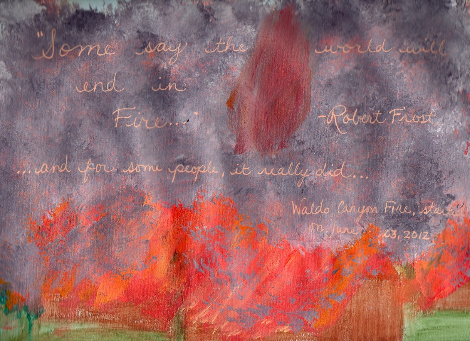
...to the Waldo Canyon Fire.  I am safe, my family is safe, no material possessions or homes have been lost, for me and mine.  We are so, so blessed.

You may have heard about it on the news.  Last Tuesday, June 26, 2012, the wildfire that had been burning outside of Colorado Springs decided to jump right outta Queen's Canyon, and into a neighborhood called Mountain Shadows.

I remember sometime in the middle '80's, when Mountain Shadows was the location of the annual Parade of Homes.  We went, my family and I, and ooo-ed and ahh-ed at the posh living quarters that were being shown off.  It was considered a far outskirt of Colorado Springs, unincorporated at that point, I imagine.  I remember begging my mom, please, puh-leeeeze, let us live here, in one of these beautiful, perfect homes.  I didn't understand then that we couldn't afford it - all I knew is that I had walked into a real-life Barbie dream home (well, mountain chalet, at least).  My, how I and my little town have grown.

But that subdivision has been decimated.  Destroyed.  Devastated.  There aren't enough of, or the right kind of, words, to describe the level of destruction there.  354 homes, gone.  Burned down to the ground.  It's just, well, honestly, when I see the pictures of it and the flyovers, I'm speechless.  I know it's cliche, but it's true - it's like a horrific war movie, only no, this is real, this really happened.  It's overwhelming.

And 2 people are gone.  No one knows right now why, why they were in their home when the evacuations went out, why they didn't leave, why they didn't or couldn't get out.  I don't know who they are - I'm sure that information won't be released for weeks - but the family knows.  And my heart is floating somewhere out there, seeking them out, wishing I could say or do anything that would lighten the burden for them, the pain they feel.

It's seeking out the policeman or policewoman that had to track that family down, in all the chaos of the evacuations, to tell them the news.  It's seeking out the firefighters, who faced an unconquerable monster, who stood as David against 1000 Goliaths, hoping that everyone had gotten out alright, only to find out that no, for 2 people, they didn't.  It continues to seek out those same firefighters, and Army men, and Guardsmen, and Air Force personnel, and everyone who has come to help, who refuse to succumb to grief, for now, just for now, so that they can continue to protect us.

And it's seeking out the people that are still under mandatory evacuation, who are tired, frustrated, and lost right now, because the future of their home, their rock, is still uncertain.  They are drifters at the moment, and completely at the mercy of the fire.  That's a horrible place to be.

My heart is flying all over this city of mine, with love, with grief, with tears, with complete and utter gratitude.

I did an art journal page about this.  It's not good art, but somehow, painting homes, painting trees, painting fire, painting smoke, it helped a little.  Next, I will paint rain, and pray that it will wash over us all.


Wednesday, June 20, 2012

I'm back again - Oil Pastel Review

So, as I said in my last post (over a year ago - whoa!), I've been working more on art, and less on product comparisons.  I've finally gotten brave with sharing my art, over on Flickr, and with various mixed-media art groups I'm a part of - like The Sisterhood of the Book (Effy Wild's Book of Days program).  I've even expanded out of my art journal, and onto canvas.  

I was chatting with a friend of mine the other day, and she suggested that if folks are wanting to share their stuff, they might as well get a blog.  And I realized "Hey!  I already have a blog!  That's what I should be doing!".  So, here I am, ready, finally, to share my art and process and the whole she-bang, with all of you.

But first, I've got to do a product review.  I mean, I have to - it's been waiting to spill out of me for days.  I want to talk about oil pastels.

Now, as a disclaimer, I am not an artist who knows the ins and outs of oil pastels.  In fact, I had some for a long time, and had no idea what to do with them.  Yes, they're pretty and smooshy, but in art journals, you can't write over them (unless you use a Sharpie Poster Paint pen - Oil-Based - but that's another post).  

Oh ho, but then along came Rhomany, and her live UStream class, about using oil pastels as a final layer of color in portraits.  And all I can say is "LOVE!!".  I am smitten with them, and how blendy and smooth the finished product turns out.  I mean, just look at how smooth my blue woman came out:


So, I wanted to share with you all a little test I did of the different oil pastel brands I have, and give you a rundown of what I think.  In case you want to try Rhomany's method.  And I think you do - yes, yes, you do.

Here's the image of each of the oil pastels I ran a test on.  I scribbled over the swatch area, and then on the right side, blended it out with my finger, to show you the smushability (is that even a word?)  I did them all in peach flesh tones, because I only have one Sennelier oil pastel, and it's a peachy flesh tone.  Trust me, if you've seen how much Sennelier's are, you'd only buy one at a time, too (mine was $3.50 for 2 inches of oil pastel).


1.  Sennelier - These are the creme de la creme of oil pastels.  Creamy, ultra-blendable, rich pigment.  Luscious to work with.  However, super expensive.

2.  Crayola's Portfolio Water-Soluable Oil Pastels - Very creamy - about as creamy as the Sennelier.  As you can see, not as pigmented as the Sennelier, but definitely not as expensive.  I got my set at Staples for about $10. They have the added bonus of being water-soluable, so you can go over them with a waterbrush and make a watercolor effect.  However, they only come in 24 colors.

3.  Crayola Oil Pastels - Yup, Crayola.  I am falling in love with Crayola products.  These aren't half-bad, for the set of 28 I got.  I used both the Crayola and the Portfolio oil pastels on my blue girl above, and really like the blendability and color I got from them.  And, they were only $5.50 at my local Michael's.  

4.  Loew-Cornell Oil Pastels - I bought a set of these at Michael's over 10 years ago.  They're still laying down a rich layer of color.  And before you think I'm a total art supply junkie, I bought the Crayola Oil Pastels to replace these.  After 10+ years, they're a bit dry and I have to really smash them down to lay down color.  Makes it hard to work with them.  But, if you can find them, they're inexpensive (I think I paid $10 for the set of 36) and obviously last quite awhile.  If I'd found these, I would have bought them again, instead of the Crayola.

5.  Cray-Pas Junior Artist - Ok, seriously, don't even bother with these.  I bought this set to replace the Loew-Cornell's, too, last year, when I took Pam Carriker's free online mixed-media class for Strathmore (it was a great class, by the way, and she's uploaded all 4 lessons to her YouTube channel - here's lesson 1: http://www.youtube.com/watch?v=s3eio-z-OQI&feature=plcp).  When I went to do her technique of blending the oil pastels, I rubbed these oil pastels right off of the page.  I've tried them on all kinds of paper, with gesso and without, and nope - if you want to blend them, you will rub them off.  About $7 for the set of 50, looks really yummy in the packaging, but they're just horrible.

I know that Cray-Pas makes a set of oil pastels called "Expressionist", that are supposed to be much better.  I just didn't want to invest the $20 in the set of 48 at my local art supply store.

So, my recommendation is, if you want to just try oil pastels, to see if you'll like them, then get a set of the Crayola Portfolio Water-Soluable Oil Pastels.  Personally, I'm using those, in combination with the Crayola regular set, on my portraits.  If you get serious about it, then yes, Sennelier is worth the investment.  I've also heard good things about Pentel oil pastels - that they're about in the same league as the Crayola and Loew-Cornell ones.  There's a wider range of colors with the Pentel ones, too (sold at Hobby Lobby).

So, thanks for stopping by, and I'll be seeing much, much more of you in the future!

Thursday, February 17, 2011

A Little Art Journal LOVE

ATTENTION: If you subscribed to this blog because of the experiments I was doing, I just want to warn you, this isn't an experiment post (well, unless you consider art journal pages to be experiments, which, I do). It's an art journal page post. Just didn't want you to get to the end of this post and go "Hey, where's the experiment?". :D

Connie over at Dirty Footprints Studio is hosting an art journal LOVE party this week, not only in honor of Valentine's Day, but as a celebration of when she kicked off Art Journal LOVE Letters (her art journaling online workshop), this time last year. To participate in the party, head on over to her blog by clicking on the pic below:


I realize this blog post has nothing to do with experiments - at all. I haven't done a proper experiment in almost a year, and the last post I did was after another year hiatus. I'm thinking I'm done with the experiments phase of my creative development - at least, on a grand scale.

Know what happened? I actually started DOING art, instead of just experimenting with art supplies. And I gotta tell you, I'm so grateful for all those experiments, because those were my baby steps, my way of getting over the paralyzing FEAR over doing something creative. I have a ridiculous streak of perfectionism, and while I mooned and pined and wished I could make beautiful art journal pages, every time I'd pick up a brush, I'd just about hyperventilate from fear. Fear that it wouldn't look good, fear because I don't know what I'm doing, fear of people pointing and laughing (even if I never showed another soul on this planet - no, fear is not rational), fear of the word "art". My fear/perfectionism usually manifests in a "Why bother?" attitude, as in "It won't be good/better/the best art journal page to ever exist, so why bother? You will FAIL!!"

Nice voice, eh? Do you have one, too? If not in art, in other areas?

So, what's a left-brained girl to do? Fall back on her scientific roots and experiment, that's what. Taking online classes definitely helped, too. Uploading my work into those online classes - yup, that started taking the fear down a peg or too. And having the loving support of an artist friend, who frequently reminds me that this is about the FUN of it all, not the outcome, well, that's been absolutely vital and precious to me.

And somehow, in getting to know all of these wonderful materials, in learning and experimenting, the courage to just begin came through.

I realized as I was typing this out, that what it all took was ACTION. I had to actually DO things to chip away at that snotty little "Why bother?" voice. There was no THINKING my way out of this - it took experiments, learning, talking, and sharing, to get me creating art journal pages now.

Methinks that's a life lesson right there. :D

Anyways, I'm sharing a Valentine-y page I'm working on - all pinks and reds and Love - as part of Connie's Art Journal Blog Party. It's not finished - it's at a place where I'm not sure where to go next. But it's also at a stage that I feel comfortable sharing with all of you. Pretty cool, for someone who couldn't even paint a solid-colored background 3 years ago without freaking out. :D

Pink Love Page


Thank you so much, to those that read and subscribed to this blog. Because I'm changing, the format of this blog will be changing as well. Honestly, I can't see me doing experiments, on the scale I was before. Maybe little ones, like the PanPastel experiment, but no more grand-scale ones. I just want to give anyone that subscribed a heads up about this, in case you start seeing more posts from me, but not the experiments posts you originally signed up for.

Wednesday, April 28, 2010

A wee experiment with PanPastels

Well hello all! It's nice to see you, and nice to be blogging again. :D Nothing really happened in the last, oh, year or so that I stopped blogging here, lol - no family emergencies, no mid-life crisis', no life-changing events. I just wasn't doing any experiments. It happens - my need to be an art scientist waxes and wanes. However, with Spring springing, and me learning new art techniques, there are a few things I'm wanting to try out. And of course, when I try something out, I want to share it, in case it will benefit anyone else.

Today, I did just an easy experiment with PanPastels. I've been hearing about these little stacks of wonder from so many places, and they've inspired some serious art supply lust in me. From what I understand, people are enthralled with PanPastels because of the lack of dust and their blendability. I love how Teesha Moore uses them to shade her journal pages. I limited myself to one, and only one, as a tester - at $5 per pastel (and that's at Dick Blick - it was a little over $6 at my local art supply store), this is not an art supply I can just run out and invest in a whole set.

Let me add a couple of caveats before I get started. First, I am not a pastel artist. I cannot even begin to comment on whether this is the right product for the real pastel artists out there. I'm just a beginning crafter/artist, who likes to dabble with lots of art supplies, and so this experiment is geared for folks like me - the dabblers. :D The second caveat is that this experiment was quick and dirty (literally, lol - my hands are a nice shade of grey at the moment), so I've foregone a lot of my usual structure when it comes to this experiment.

Ok, on with the experiment!

I wanted to test a couple of things with this experiment:

1. Are PanPastels really less dusty?
2. Is there any difference in the color intensity, between the PanPastel and the Sennelier soft pastels that I have? Meaning, can I swipe a sponge over a Sennelier soft pastel, and get them to blend like the PanPastel, without losing color intensity along the way?
3. Can I use cheap cosmetic sponges to apply the PanPastels, or is it really better to use the Sofft tools that PanPastel makes for these?

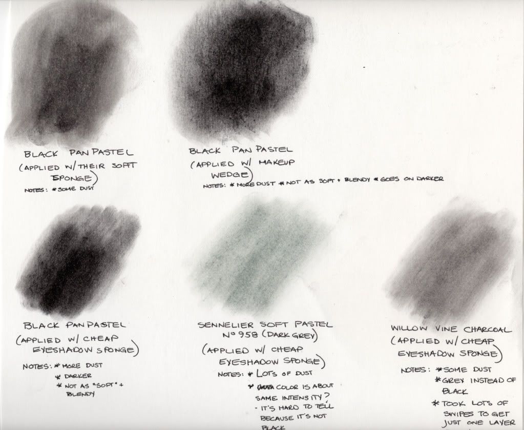
Here's the picture that reveals all:

(click to enlarge)


The Results:

1. Are PanPastels really less dusty?

YES, by far. While I did get some dust using their Sofft tool, and more dust using cheap cosmetic wedges and eyeshadow applicators, it was nothing compared to the Sennelier soft pastel.

2. Is there any difference in color intensity between a PanPastel and a Sennelier soft pastel?

Yes, it seems PanPastels do have more intensity, using the sponge method. But, it's also hard to tell from my experiment, because I don't have a black Sennelier soft pastel, so I'm not comparing black to black. Also, I didn't use the No. 958 Cinereous Grey Sennelier (my darkest Sennelier pastel) as it was made to be used - by drawing with it. So no, it didn't come out as dark, by just swiping the sponge over it, and applying the sponge to the page. However, it may darken up significantly with more layers.

I wanted to see if I could blend a Sennelier pastel like it was a PanPastel (because I already have a set of Sennelier's, and Sennelier also makes glittery, shimmery pastels that are just so beautiful), and it looks like I can - I'm just going to need more layers. Or maybe I should just draw with it and use an eyeshadow sponge to blend it out. See, I told you I wasn't a pastel artist - they'd know how to achieve that soft, blendy look with a Sennelier. :D

3. Can I use cheap cosmetic sponges, or do I really need to use the Sofft tools that PanPastel makes for these?

Well, that's a matter of personal preference. There is a difference between using the Sofft sponge, and using a drug-store cosmetic sponge. With the Sofft tool, there was less dust, and the pastel seemed to blend more, and come out softer. However, with the cosmetic sponge (and subsequently, the eyeshadow sponges), the color is closer to a true black, with harder "lines". It's not quite as "blendy". So, if you want your PanPastel to show up darker, and not be as soft, then use cosmetic sponges. It will certainly save you money!

As a bonus, I also tried to swipe an eyeshadow sponge over some willow vine charcoal, and apply it like I had the Sennelier soft pastel, just to see how the Black PanPastel would compare with the charcoal. Wow, is all I can say - PanPastel has got charcoal beat as far as a true black goes - at least, the way I applied it. If I'd drawn with the charcoal, it might have come out much darker.

So that's it, a quick and dirty experiment with a PanPastel. I'm not sure I'm sold. I love how soft and blendy it looks, but I also wonder if I can achieve that look with my Sennelier's, that I've already invested money in. So for me, the jury is still out.

Monday, July 27, 2009

The Great Pearl-Ex + Mediums Experiment of Ought-Nine - Part Two

So, here we go, for Round Two of the Great Pearl-Ex + Mediums Experiment of '09. This time, I'm trying out my more unusual acrylic mediums, of the gel and paste variety. For Part One, please see this post. If you'd like to know more about Pearl-Ex, please visit Jacquard's website.

The Products:

For my Pearl-Ex mica powder, I again chose Aztec Gold (Product # 658), to use throughout these experiments. It's a rich, warm yellow gold that reminds me of gold leaf.

Here are the mediums that I mixed with the Aztec Gold for this round of experiments:
  • Golden's Clear Tar Gel
  • Liquitex Glass Bead Gel
  • Golden's Garnet Gel
  • Golden's Acrylic Ground for Pastels
  • Liquitex Blended Fibers Gel
  • Golden Light Molding Paste
  • Golden Crackle Paste
The Process:

Here, because of the nature of the mediums I was using, I chose a slightly different process than the first experiment. I took the same mini-scooper of Pearl-Ex powder, but used a full scoop of the powder (instead of only the 1/2 scoop in the 1st experiment), and added it to a little Dixie cup. Then, I added about a tablespoon of each medium, one per Dixie cup. It's too hard to pull out these mediums in 1/2 teaspoon quantities, so I opted to increase the amounts, while keeping the ratio of medium/Pearl-Ex about the same.

I then mixed each medium with its Pearl-Ex with a popsicle stick. Then, I painted all of the Pearl-Ex mixtures onto pre-labeled 3 inch x 4 inch black cardstock, so we could see how vibrant the Pearl-Ex would turn out. Each piece of cardstock only got one layer, although some of the layers are thicker than others, due to the nature of the medium (Light Molding Paste, Blended Fibers and the Crackle Paste). The only medium I didn't paint right away was the Clear Tar Gel - I waited about a half an hour before painting with it. Clear Tar Gel gets air bubbles in it very easily when it's stirred up, so I had to wait for some of the air bubbles to come to the surface.

After all of the mediums had dried, I taped them all together onto a larger piece of black cardstock, and photographed the results. I took two sets of pictures - one with flash, and one without. Because of the metallic nature of Pearl-Ex powders, it's easier to see their properties when you can view them in two different sets of lighting. It's kind of a virtual way of being able to "tilt the card", like you would in real life.

The Results:
Here are the mediums I used, labeled 1-7, as they correspond to the pictures:
  1. Golden's Clear Tar Gel
  2. Liquitex Glass Bead Gel
  3. Golden's Garnet Gel
  4. Golden's Acrylic Ground for Pastels
  5. Liquitex Blended Fibers Gel
  6. Golden Light Molding Paste
  7. Golden Crackle Paste
Here are the results, from a picture taken with my Sony DSC-F828, without flash:
(click to enlarge)

Here are the results, from a picture taken with my Sony DSC-F828, with a low flash (higher levels of flash, on my camera, tend to wash everything out):
(click to enlarge)

Conclusions:

Again, the Pearl-Ex Aztec Gold mixes beautifully with every medium I've thrown at it (no clumping or non-mixing, which has happened with some Pearl-Ex powders on me - namely "Flamingo Pink", "Brilliant Yellow" and "Turquoise").

Now I have another keyword to add to my "These Don't Do Well with Pearl-Ex" list - Opaque. So, "Matte" and "Opaque" - got it. The Crackle Paste and the Light Molding Paste are both opaque (I assume they have some Titanium or Zinc White added to them), and the vibrant metallic color of the Aztec Gold Pearl-Ex just disappeared in them. The same thing happened with the Acrylic Ground for Pastels, although, I can see what looks like a glittery-shimmer mixed into the medium (not obvious in the photo, but I can see it in real life). I think a wash of Pearl-Ex over these mediums will show up beautifully, just not mixed in them.

It's hard to tell in these photos (and I'm not sure why), but the Clear Tar Gel and Glass Bead Gel are just as vibrant as the results I got with Liquitex's Gloss Medium and Varnish (now my favorite Pearl-Ex medium paint-maker, besides Gum Arabic). I'm not really sure what to do with the Glass Bead Gel, and haven't been since I first got it, but I love the effect of the Aztec Gold in it. The Garnet Gel showed a more muted effect, but there's just enough shimmer with the Pearl-Ex to make it interesting. I can see adding one of the darker, more bronze colors of Pearl-Ex, to make this look like authentic rust.

The Blended Fibers is interesting - it looks a bit like paper on the page, and with the Pearl-Ex, it looks old and slightly shiny at the same time. There is some opacity to the Blended Fibers, so I believe a wash of Pearl-Ex would do much better than it being mixed in. I'm glad I did this experiment, as prior to this, I had no idea what to do with Blended Fibers, but now, I think I can add it to molds, and it will look like a tissue paper cast.

Next up will be the last part of this experiment, where I show you how Pearl-Ex and things like Linseed Oil, Minwax's Polycrylic, Dorland's Wax Medium and Isopropyl Alcohol look.